Bình Minh Market
ROLE
Visual Designer
TIMELINE
4 weeks
(Mar - Apr 2023)
TOOLS
Figma, Procreate, Adobe Illustrator, Adobe Photoshop
Crafting a grocery store brand dedicated to sharing a taste of Vietnamese food and culture to communities at large.
Overview
01
about
Where have all the big Vietnamese grocers gone?
I’ve always wondered why there weren't any big Vietnamese grocery stores outside of Orange County. Sure, I can often get Vietnamese brands at other big names like H Mart or 99 Ranch, but an aisle of home never really hits as hard as a whole store. As Design Co’s Visual Design Apprenticeship neared the end, I knew that my final project — a new or redesigned brand identity — would be on a Vietnamese grocery store brand that could deliver that taste of home and more.
I was lucky enough to be a part of Design Co’s Visual Design Apprenticeship as an apprentice for 12 weeks, learning visual, graphic, and brand design through a variety of hands-on assignments. This was my final project.
problem statement
How might we create a grocery store brand that represents the excellence of Vietnamese food and culture, while also making every shopper feel welcome?
design solution & highlights
Enter Bình Minh Market, on a mission to provide authentic Vietnamese food & culture
Bình Minh Market is a grocery store brand dedicated to sharing the taste of Vietnam — traditional and modern — to communities who have never known it, missed it dearly, or always been curious. Whether you’re a young adult that misses the taste of home, a parent that needs ingredients for a big family dinner, or a 30-something year-old that’s never tried jackfruit, they’ve got something for each and every one of you.
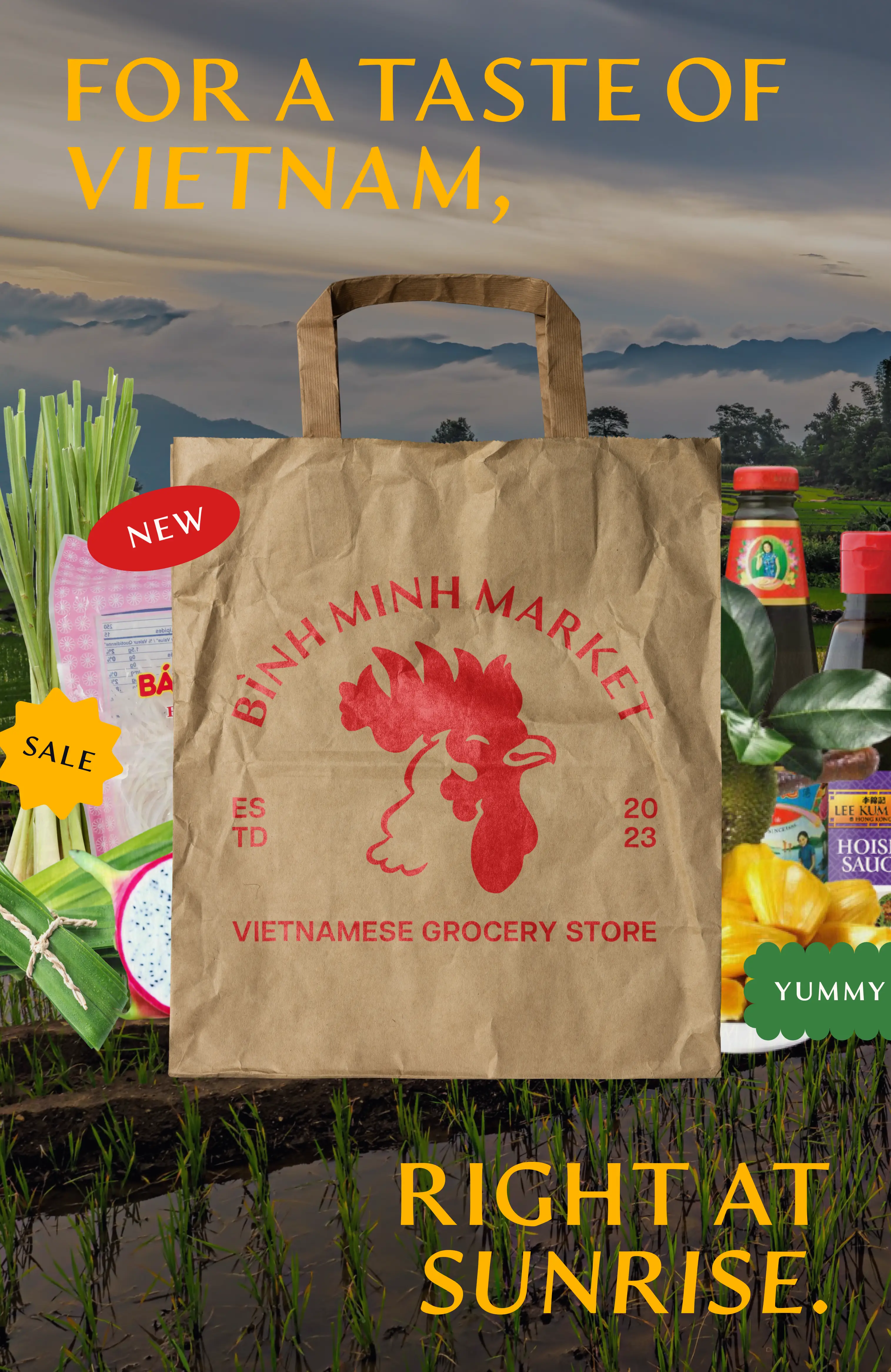
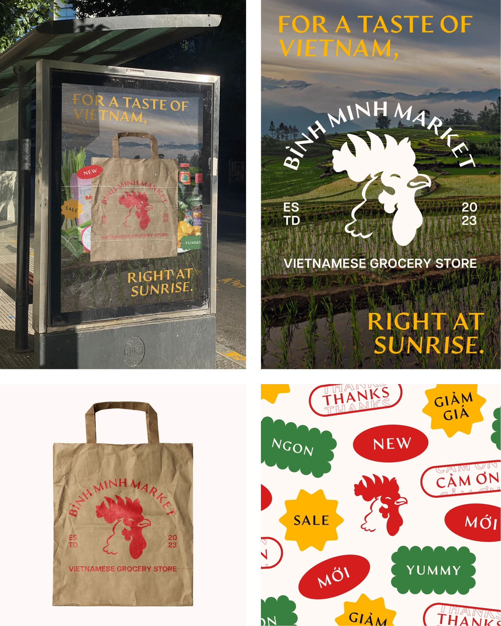
Bình Minh Market’s primary logo, English and Vietnamese stickers, and most recent ad.
Design
02
competitive analysis
What others have done well, what could improve, and what to focus on
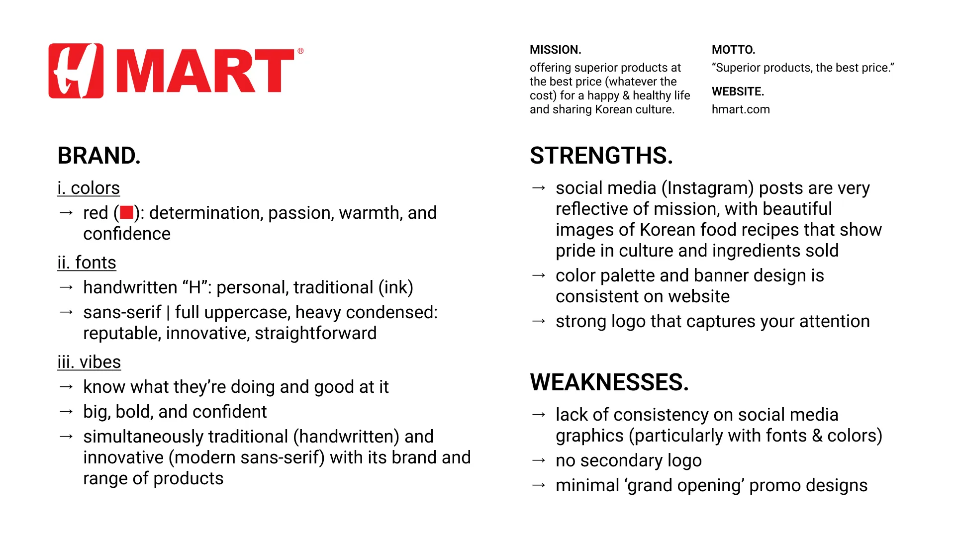
Given the lack of big Vietnamese grocery store names, I ran a competitive analysis on popular Asian supermarket chains like 99 Ranch Market, H Mart, and Tokyo Central and paid close attention to their individual missions and visual design.
Competitive analysis of the visual design of three popular Asian grocery store brands: 99 Ranch Market, H Mart, and Tokyo Central.
From here, I was able to draw several key insights that would later shape Bình Minh Market.
All offer ‘superior’ quality produce and ingredients
All promote a secondary mission that puts the customer’s comforts first
99 Ranch & H Mart in particular aim to share Asian / Korean culture with all
All make use of serif fonts in all caps, which bring about a sense of modernity and trust
99 Ranch & H Mart favor red in their branding, with H Mart making use of a particular bright red to draw attention
moodboard
Defining the tone, colors, and vibes
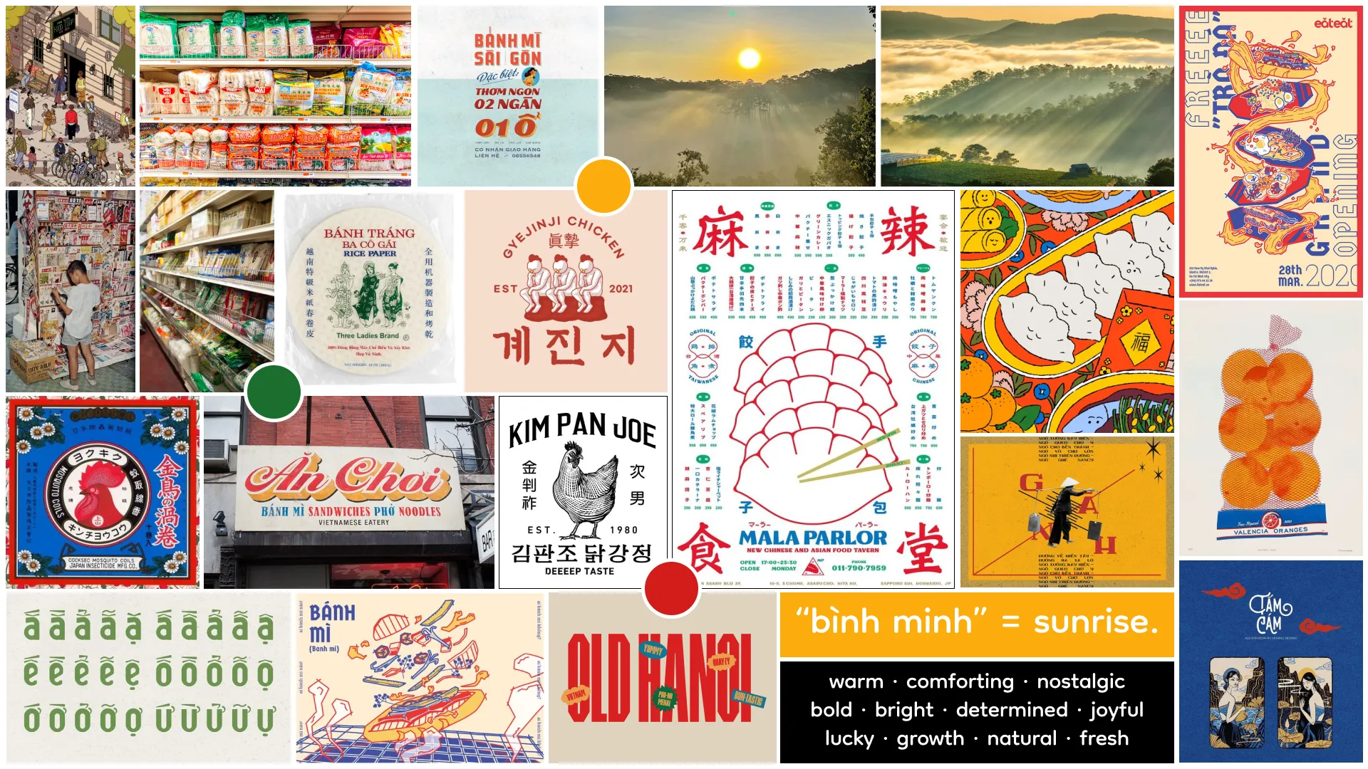
I also organized a moodboard of bold, nostalgic, and bright branding, colors, and visuals from the internet for inspiration.
The moodboard for Bình Minh Market, comprised of photos of Vietnamese products, Pinterest posts, and tone words I chose.
brand identity
Bình Minh Market: warm, comforting, nostalgic, and bright
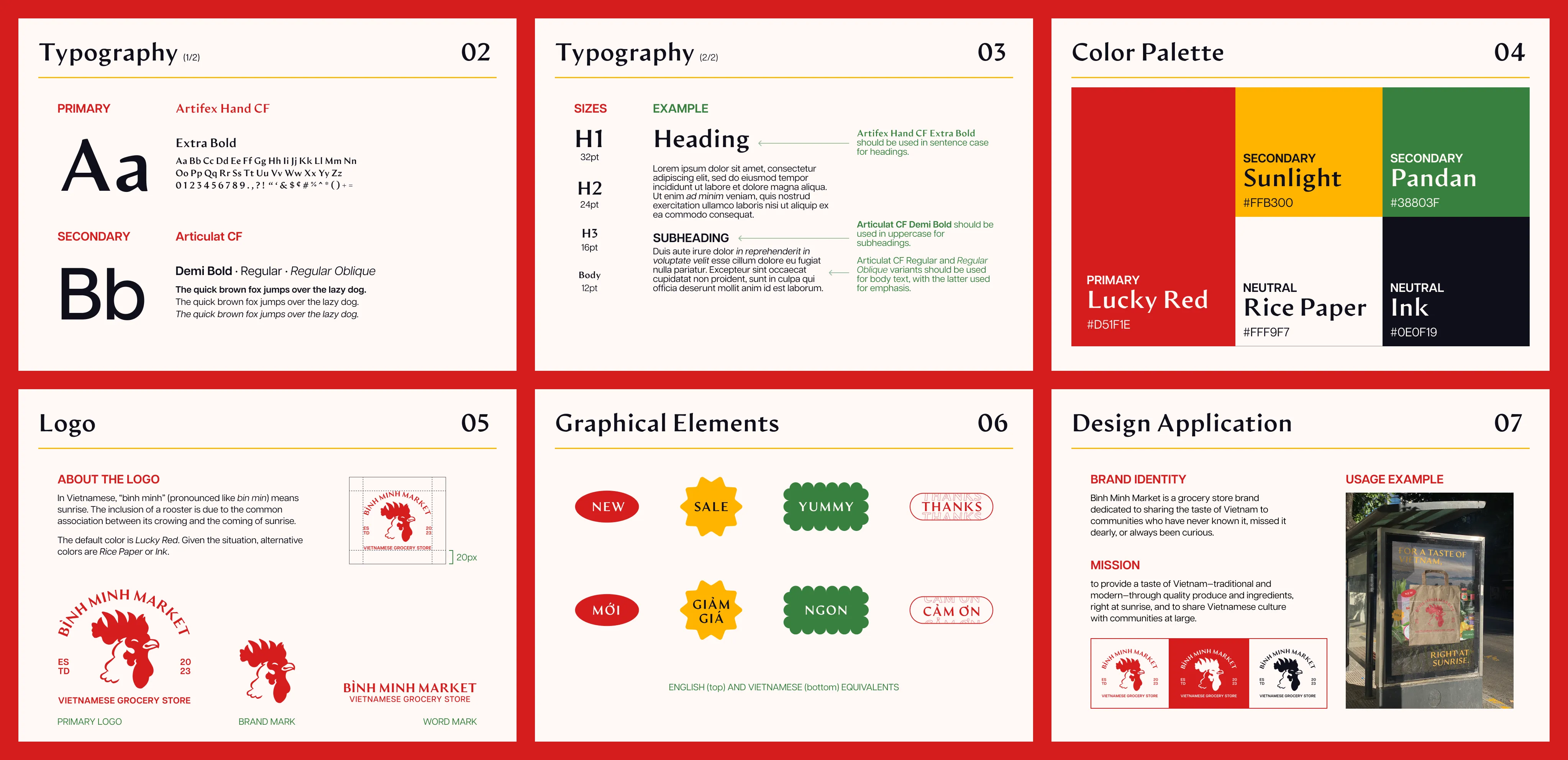
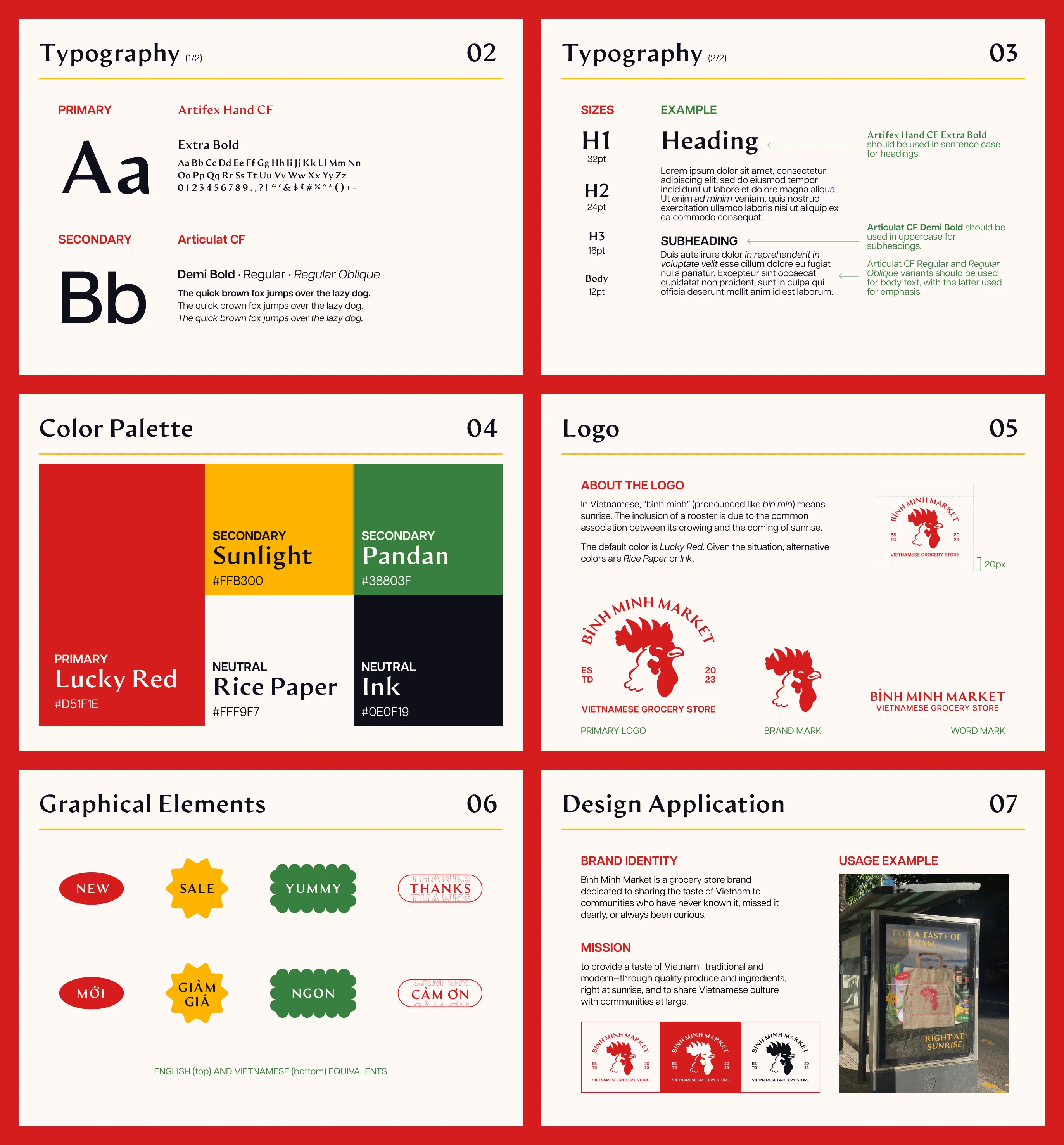
Bình Minh Market’s style guide, which details its typography, color palette, logo variations, graphical elements, and design application.
Typography that expresses both tradition and modernity
As a Vietnamese grocery store brand, it’s essential for their typefaces to have full language support for Vietnamese. Both primary and secondary typefaces are sans-serif typefaces with multiple weights and inclusive language support.
Artifex Hand CF, Bình Minh Market’s primary typeface, is reminiscent of traditional, handwritten styles, while Articulat CF, the secondary typeface, provides round and friendly forms that’s easy to read. Paired together, the two make for a good blend of tradition and modernity that Bình Minh Market offers.
From left to right: All Vietnamese vowels typed out in the primary typeface, followed by the secondary typeface, and a type test.
Colors that feel warm, auspicious, and inviting
I wanted a warm and bright color palette — colors that matched the tone of Bình Minh Market — so what better primary color than red? Here, red catches your attention and is reminiscent of the auspicious red envelopes with money (lì xì) given to the youth on Lunar New Year. Red also connects back to a sunrise (the English equivalent of bình minh), especially when paired with a bright and happy yellow. The inclusion of green, representative of the farmlands and fresh produce, completes the picture of an early sunrise peeking over an horizon as the sun makes its way up.
The color palette for Bình Minh Market, complete with hex codes and RGB values.
A logo that signals sunrise
In Vietnamese, bình minh (pronounced bin min) means sunrise. The crowing of a rooster is commonly associated with the coming of the latter, so it made perfect sense to have a rooster as the logo for Bình Minh Market.
From not-a-thought-in-its-head to, frankly, a little intimidating, Bình Minh Market’s rooster has come a long way to end up as its friendly, smiling self. Paired with type circling over its head (the rising sun) and horizontal type underneath (the horizon), the rooster transitions from brand mark to the primary logo.
Logo ideation, starting from the top left and ending at the bottom right.
design application
On the streets, paper bags, and digital posters
After finalizing the brand identity, I designed a set of stickers for labeling products in-stores and decorating potential graphics and advertisements. Using Photoshop, I also produced a mock-up of Bình Minh Market paper bags, which I doubt a grocery store would lack, and one for an advertisement.
The final designs and mock-ups.
Reflections
03
what i learned
Congrats, you’ve gained an Adobe Illustrator level!
From using Adobe Illustrator’s Type on a Path tool for the very first time to scouring the Internet for the perfect font, working on Bình Minh Market has allowed me to practice my creative thinking skills, grow familiar with different design programs, and refine my design process. All I wanted was to dream up a big Vietnamese grocery store (because seriously, where are they among all the 99 Ranch Markets, Tokyo Centrals, and H Marts?) and now I’ve learned just how much detail goes into deciding all the not-so-little things that make up a brand.
next steps
Moving on from digital and designing the physical every day
If I had the time, I’d create the layout for the market’s weekly deals paper, design the in-store banners for each grocery section, and develop a template for product price tags, since it’d be nice to see how the brand translates to the physical designs that shoppers rely on regularly.


