Mekong Cuisine Lao & Thai

ROLE

UI/UX + Visual Designer
Communication Liaison

TIMELINE

11 weeks
(Jan - Mar 2024)

TOOLS

Figma

team

4 designers

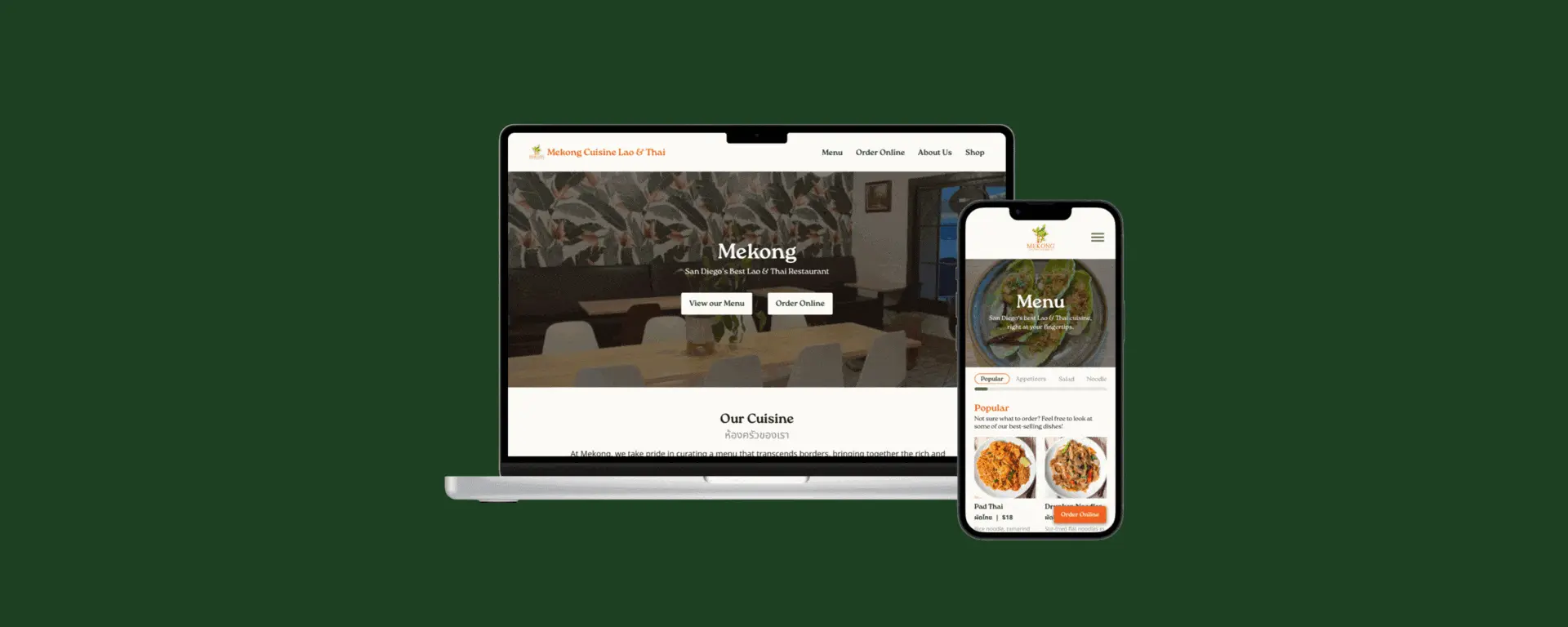
Revamping Mekong Cuisine Lao & Thai’s website to boost ease of online ordering, promote their restaurant, and highlight the community.

#WEBSITE-DESIGN

#VISUAL-DESIGN

#UI/UX-DESIGN

#WEBSITE-DESIGN

#VISUAL-DESIGN

#UI/UX-DESIGN

#WEBSITE-DESIGN

#VISUAL-DESIGN

#UI/UX-DESIGN

#WEBSITE-DESIGN

#VISUAL-DESIGN

#UI/UX-DESIGN

Overview

01

about

A welcoming, cozy restaurant cooking authentic Lao & Thai food in the heart of Convoy

Mekong Cuisine Lao & Thai is a restaurant that offers authentic Lao & Thai food, quality sit-in service, and online ordering for carryout or delivery. Located in the heart of San Diego’s Convoy district, Mekong provides a welcoming, cozy ambiance for families and friends alike to enjoy delicious, authentic Lao & Thai cuisine. 

role

Designing Mekong’s visual style, building the menu page, and coordinating meetings

As fans of Mekong’s food and students taking Dr. David Kirsh’s Practicum in Professional Web Design course, we reached out to Mekong with an offer to redesign their website. Coincidentally, Mekong was just planning on revamping the website to prepare for their upcoming expansion, so they took us up on our offer. Together, the four of us split our tasks equally, from research to the designs themselves. I took responsibility for the following:

Visual + UI/UX Design
  • Designed and prototyped the low-fidelity and high-fidelity versions of the Menu page.

  • Conducted the last round of user testing before the final iteration.

  • Worked on further iterations of the high-fidelity prototype following user-testing.

  • Created a style guide to reflect Mekong Cuisine Lao & Thai’s brand refresh — colors, typography, and all — on their website.

Communication
  • Maintained regular communication with our client, Mekong’s general manager and creative director, through weekly updates.

  • Coordinated and facilitated team meetings with our client.

problem statement

How might we support customers through the online ordering process, highlight the restaurant’s food, and accurately represent their brand?

design solution & highlights

Reintroducing Mekong Cuisine Lao & Thai —

Ordering online made effortless right from the get-go

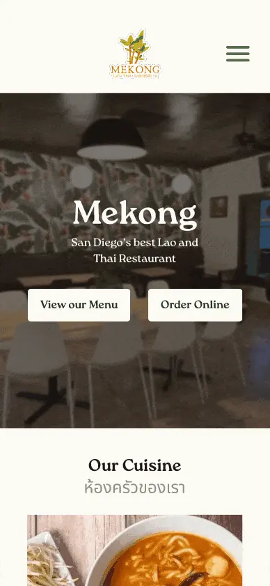
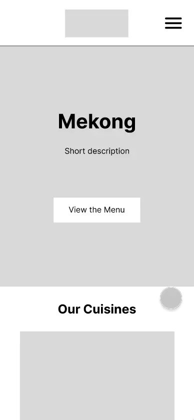
The home page now features shortcuts to view the menu and order online, eliminating the required jumps on the mobile version and allowing users to figure out what they want and order right away.

New About and Shop pages to support and get to know Mekong better

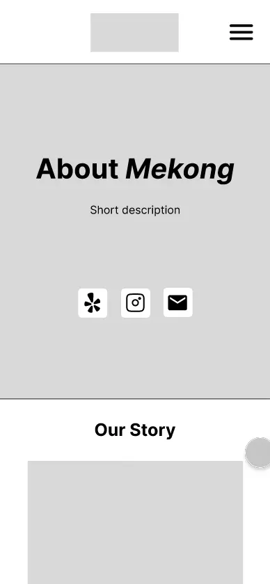
The newly added About page allows customers to learn about Mekong’s history and community, while the Shop page lets Mekong give customers a taste of Laos and Thailand from the comforts of their own homes.

A refreshing, clean new look for Mekong to highlight their food and ambiance

The redesign features a minimal, fresher look with pops of greens and orange paired with numerous photos of their delicious food, friendly community, and cozy restaurant.

Research

02

setting objectives

Defining key goals for the website redesign

In a preliminary meeting with Stella, Mekong’s general manager and creative director, we set the following objectives to guide our redesign moving forward.

  • Communicate Mekong’s history and community-oriented atmosphere

  • Draw more attention to Mekong’s online ordering services and make them easy to use

  • Highlight the unique and robust menu options that Mekong offers 

  • Improve the presentation of different actions a customer can take on the website such as viewing the menu and accessing contact information

  • Set up the framework for a projected shop page where customers can purchase merchandise and house-made sauces

user interviews

Cluttered layouts, inconsistencies, and low quality images are infamous

We conducted user interviews with 13 individuals — a mix of Mekong customers and those who haven’t gone — to understand their perception of Mekong and its website’s functionality and aesthetics. Through these interviews, we learned that:

The Menu page felt overwhelming and cluttered, making it hard for interviewees to effectively look through it and order. They’d prefer more organization and descriptions.

“It’s a bit of a stimulus overload…I don’t get how they organize things. A section that’s dedicated to bestsellers would help, because a customer would probably have a hard time figuring out what to eat.”

- Interviewee 13

“It’s a bit of a stimulus overload…I don’t get how they organize things. A section that’s dedicated to bestsellers would help, because a customer would probably have a hard time figuring out what to eat.”

- Interviewee 13

“It’s a bit of a stimulus overload…I don’t get how they organize things. A section that’s dedicated to bestsellers would help, because a customer would probably have a hard time figuring out what to eat.”

- Interviewee 13

While the abundance of photos on the Home page made a good impression, the images’ low quality, cramped layout, and lack of captions bothered interviewees.

“The gallery is nice but the images are too big and don’t tell you anything about the food…having the names there would be nice.”

- Interviewee 8

“The gallery is nice but the images are too big and don’t tell you anything about the food…having the names there would be nice.”

- Interviewee 8

“The gallery is nice but the images are too big and don’t tell you anything about the food…having the names there would be nice.”

- Interviewee 8

The branding felt inconsistent to many interviewees, who noticed the varied styles across the website, the lack of a logo, and a discrepancy between the Mekong’s cozy atmosphere and the website’s generic style. 

“I think it’s very minimalistic…there doesn’t seem to be any clear branding, since the logo and menu and website all don’t match.”

- Interviewee 4

“I think it’s very minimalistic…there doesn’t seem to be any clear branding, since the logo and menu and website all don’t match.”

- Interviewee 4

“I think it’s very minimalistic…there doesn’t seem to be any clear branding, since the logo and menu and website all don’t match.”

- Interviewee 4

Most interviewees routinely rely on the reviews and testimonials of previous customers to finalize where and what to eat — things Mekong’s website lacks.

“I like Yelp with their recommendations and reviews since those help me decide, so I’d like a little section of suggestions by Mekong or their customers.”

- Interviewee 1

“I like Yelp with their recommendations and reviews since those help me decide, so I’d like a little section of suggestions by Mekong or their customers.”

- Interviewee 1

“I like Yelp with their recommendations and reviews since those help me decide, so I’d like a little section of suggestions by Mekong or their customers.”

- Interviewee 1

user personas

Mekong’s customers: adventurous foodies, busy college students, regulars, and more

With our newly gained insights, we created three user personas:

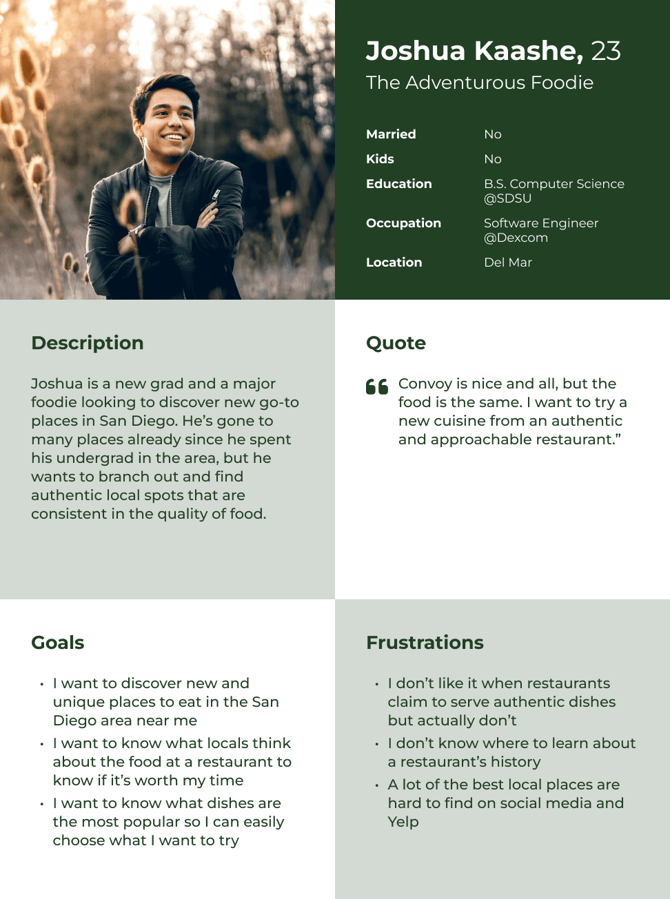
  • Joshua represents the adventurous foodies: potential customers that rely on reviews, testimonials, photos, and clear information to determine if a restaurant is worth visiting.

  • Alexa represents the busy college students: local customers that rely on online ordering, an easy to navigate menu, and images of the food accompanied by descriptions.

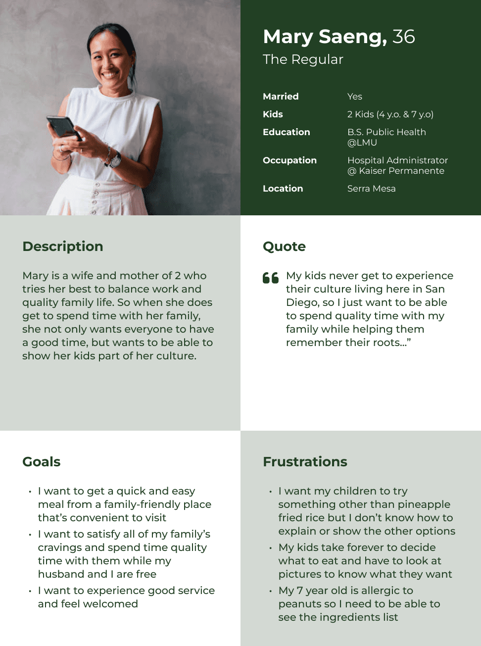
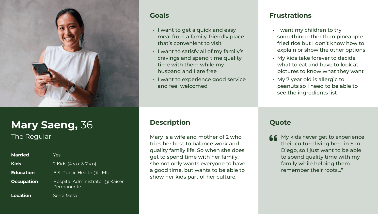
  • Mary represents the regulars: frequent customers that want to introduce others to Mekong, would like to provide feedback, and learn more about Mekong and their dishes.

These personas helped us flesh out different user scenarios and flows, later allowing us to develop a comprehensive list of features to include in the redesign.

The user personas we created to better empathize with how different users would approach each situation.

competitive analysis

Prioritizing simplicity, efficiency, and accessibility

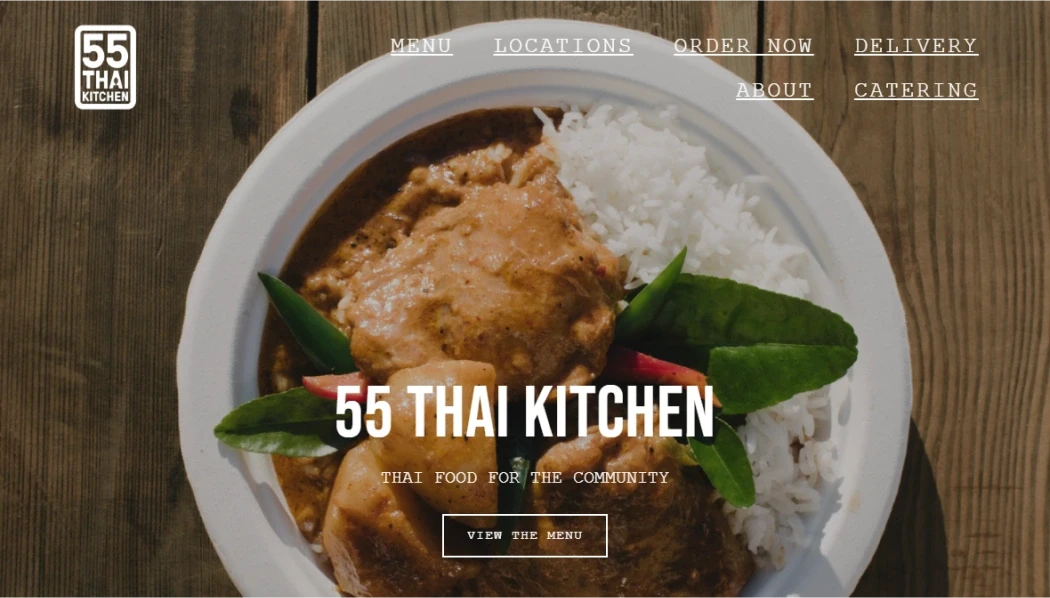
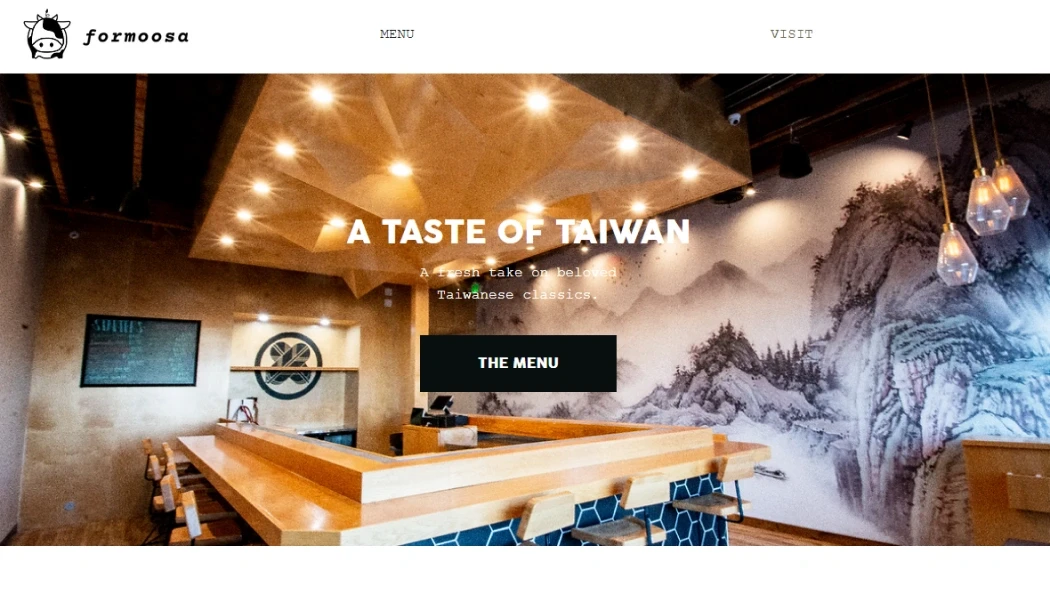
We then coordinated a competitive analysis on 5 similar restaurants’ branding, site architecture, functionality, and content to identify common, good ideas to potentially emulate and focus on for Mekong’s redesign. Through it, we found that doing the following would help our redesign succeed in meeting Mekong’s objectives.

  • Keep branding simple, cohesive, and accessible.

  • Allow for quick and easy navigation.

  • Make the website responsive and dynamic.

  • Be generous with information — history, menu details, and all — but specific and concise with it.

From left to right: Koon Thai Kitchen, Woomiok, 55 Thai Kitchen, Steamy Piggy, and Formoosa.

Design

03

ideation

Moodboards, wireframes, and foundations

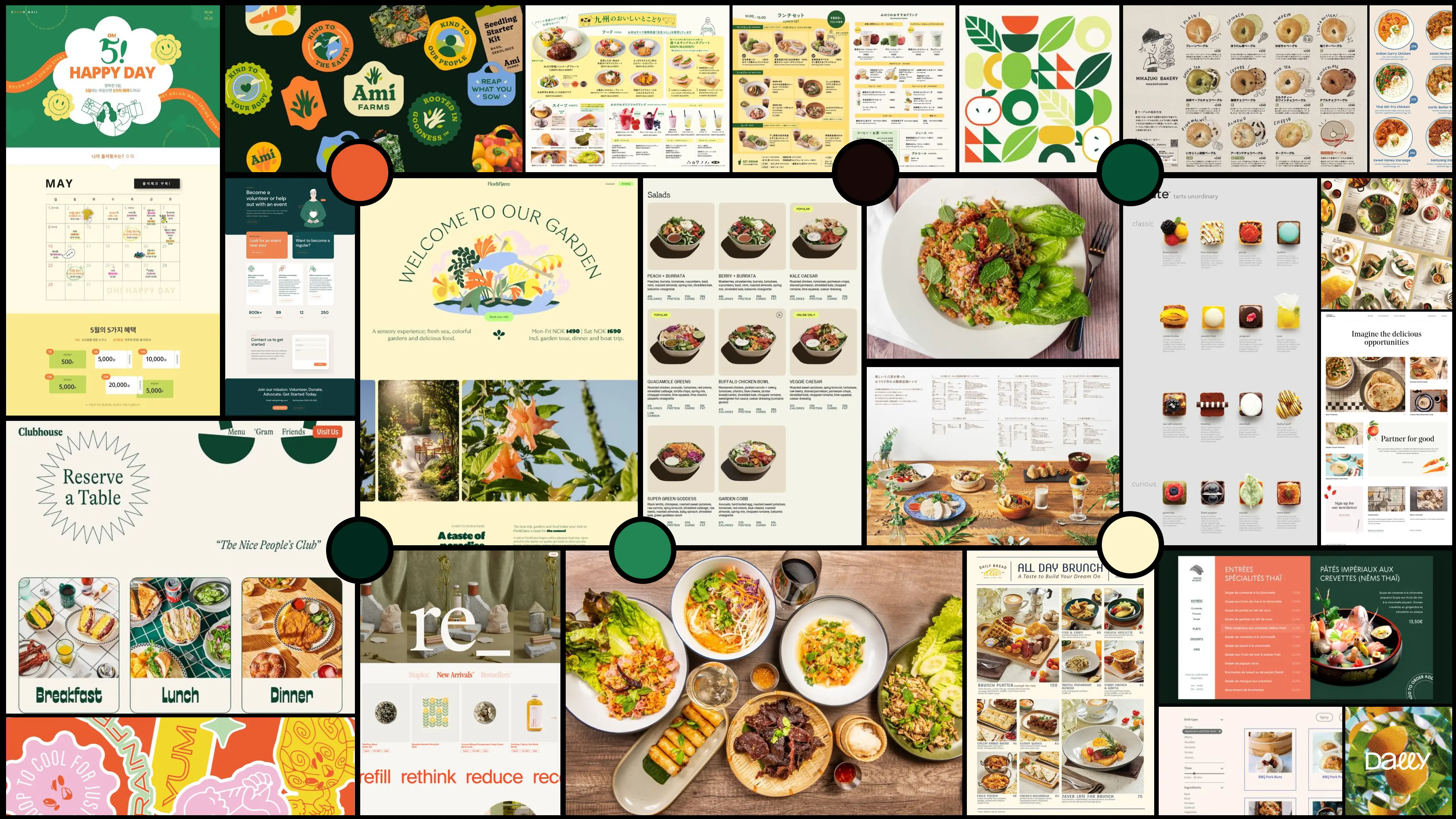
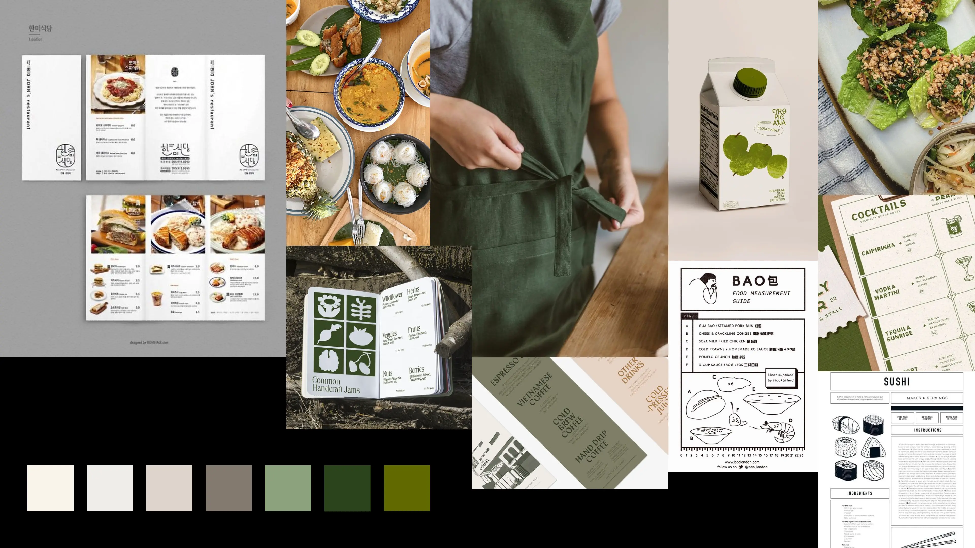
Before going into lo-res sketches and wireframes, we held a discussion with Stella regarding Mekong’s branding and layout preferences in order to inform our direction going ahead. The following moodboards guided our discussion and helped us focus on what Mekong’s branding should be — punchy, clean, refreshing, and authentic.

The moodboards we created and presented to Stella.

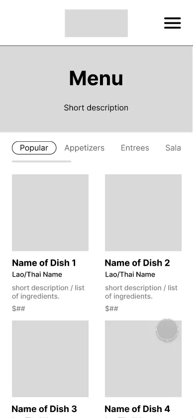
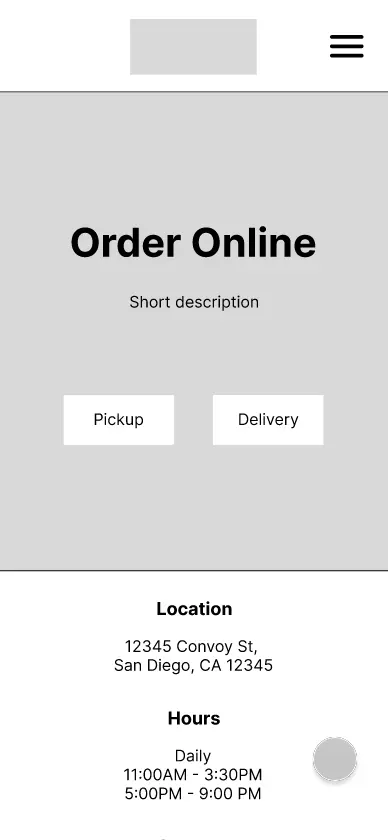
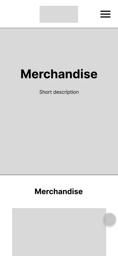
With what we learned from our user interviews, discussions with our client, and Mekong’s competitors, we produced wireframes for the mobile version. These featured frames for new pages like Menu and Shop, clear CTAs throughout, simplified layouts, and a logical type hierarchy.

Our wireframes! From left to right: home, navigation, about, menu and pop-up, order online, and merchandise pages.

from mid-fi to hi-fi

Building off our wireframes, prototyping interactions, and collecting feedback

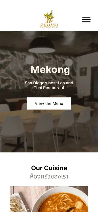
We then transitioned over to making mid-fi designs for the mobile and desktop versions, focusing on building out interactions to facilitate navigation. This was later followed by a short user test to evaluate the site’s layout and organization, with more attention paid to the menu layout and ease of navigation. While one user test is in no way representative of an entire audience’s experience, this helped us with quick edits before the hi-fi and further in-depth user testing.

Our mid-fi designs were positively received! The tester provided helpful suggestions regarding the sizing of certain copy and photos.

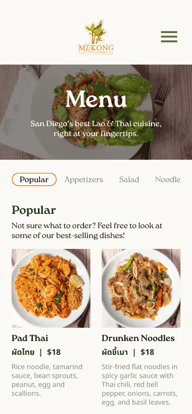
As we moved from mid-fi to hi-fi prototypes, the menu page proved to be a challenge. Formatting an extremely large menu with 81 dishes and all its necessary info — name, price, description, and ingredients — in a way that isn’t overwhelming took time. Further user testing was very helpful in this aspect.

user testing & Iterations

Multiple rounds of user testing and critique sessions make for good improvement

After completing the hi-fi prototypes, we held two rounds of user testing and a feedback session with our client. The first round involved 4 individuals and their perception of the website’s visuals, clarity, and usability, while the second round involved 2 individuals and their experience of the website’s navigation and organization.

With their feedback, we were able to refine our visuals, tweak components for higher accessibility, and create additional features for usability.

01. Adding an ‘Order Online’ button to the Menu page

Before

The Menu page had no way to quickly order food on the mobile version beyond using the hamburger menu, which requires 2 steps. Some testers requested a shortcut, stating it’d be more convenient to be able to order right away once they see a dish they like.

After

I added an ‘Order Online’ button that would stay fixed at the bottom as users scroll through the menu. The color was changed to orange following the second round in order to pop out.

02. Revising the type hierarchy on the Menu page

Before

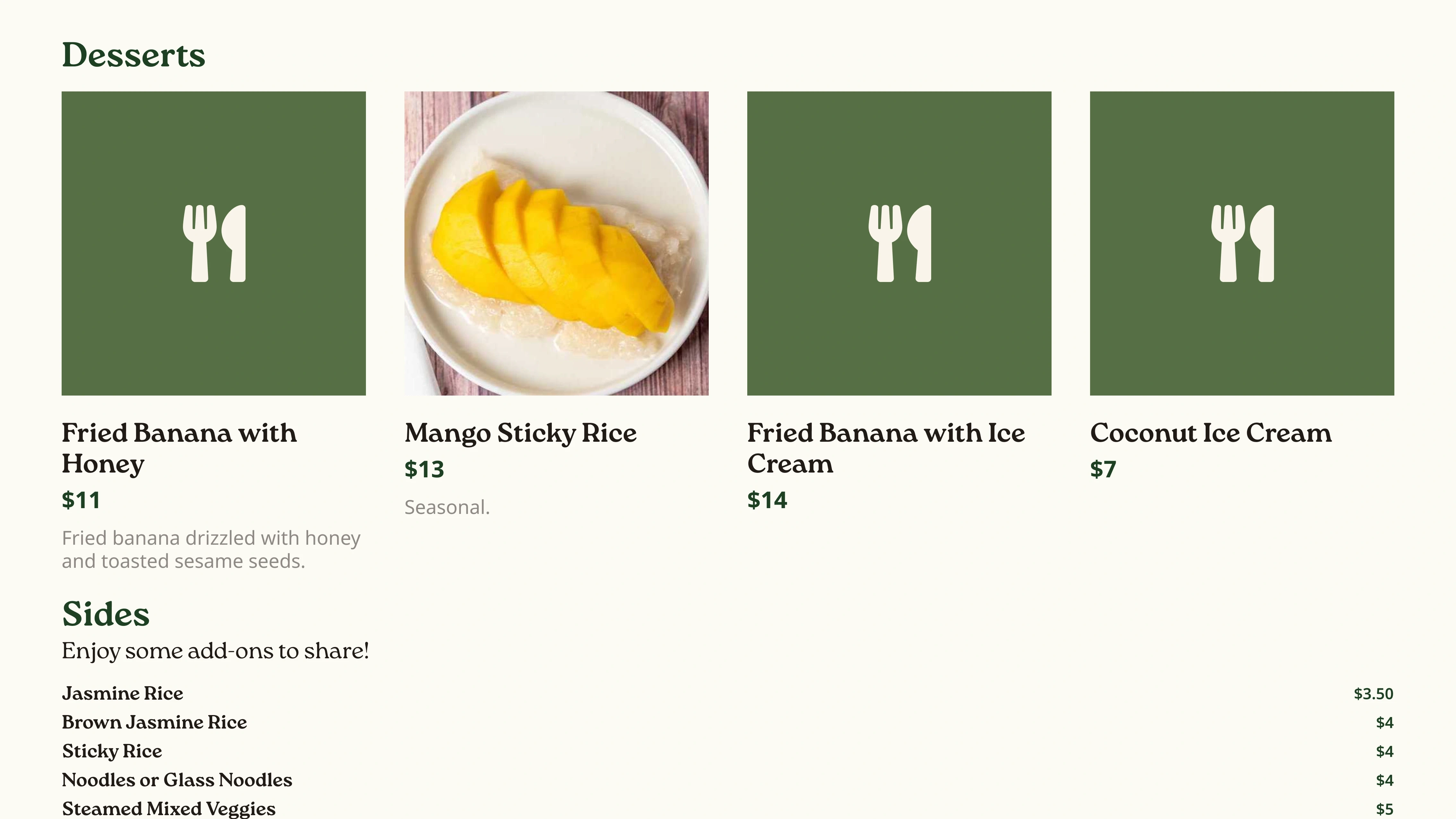
The font sizes of menu items, headers, and descriptions on the desktop and mobile versions were very similar to each other, making it hard for testers to distinguish between sections. In the desktop version, some item names were simply too small.

After

I edited the font sizes for readability and clarity, added more padding to separate sections, and changed the color of section titles to orange to distinguish them better.

03. Creating a horizontal scroll indicator for menu categories

Before

The Menu page’s food category navigation bar provided little indication that there were additional categories beyond ‘Noodle’, leaving testers ignorant of the fact that they could scroll.

After

To address this, I added a horizontal scroll indicator under the food category navigation bar.

04. Adjusting the navigation bar buttons’ hover state contrast

Before

The navigation bar buttons’ hover state was very similar to the default state, as the color only changed from a dark green to a barely lighter green. Some testers were concerned that this change was too subtle.

After

We lowered the opacity of the button for the hover state to provide greater contrast and a distinct difference.

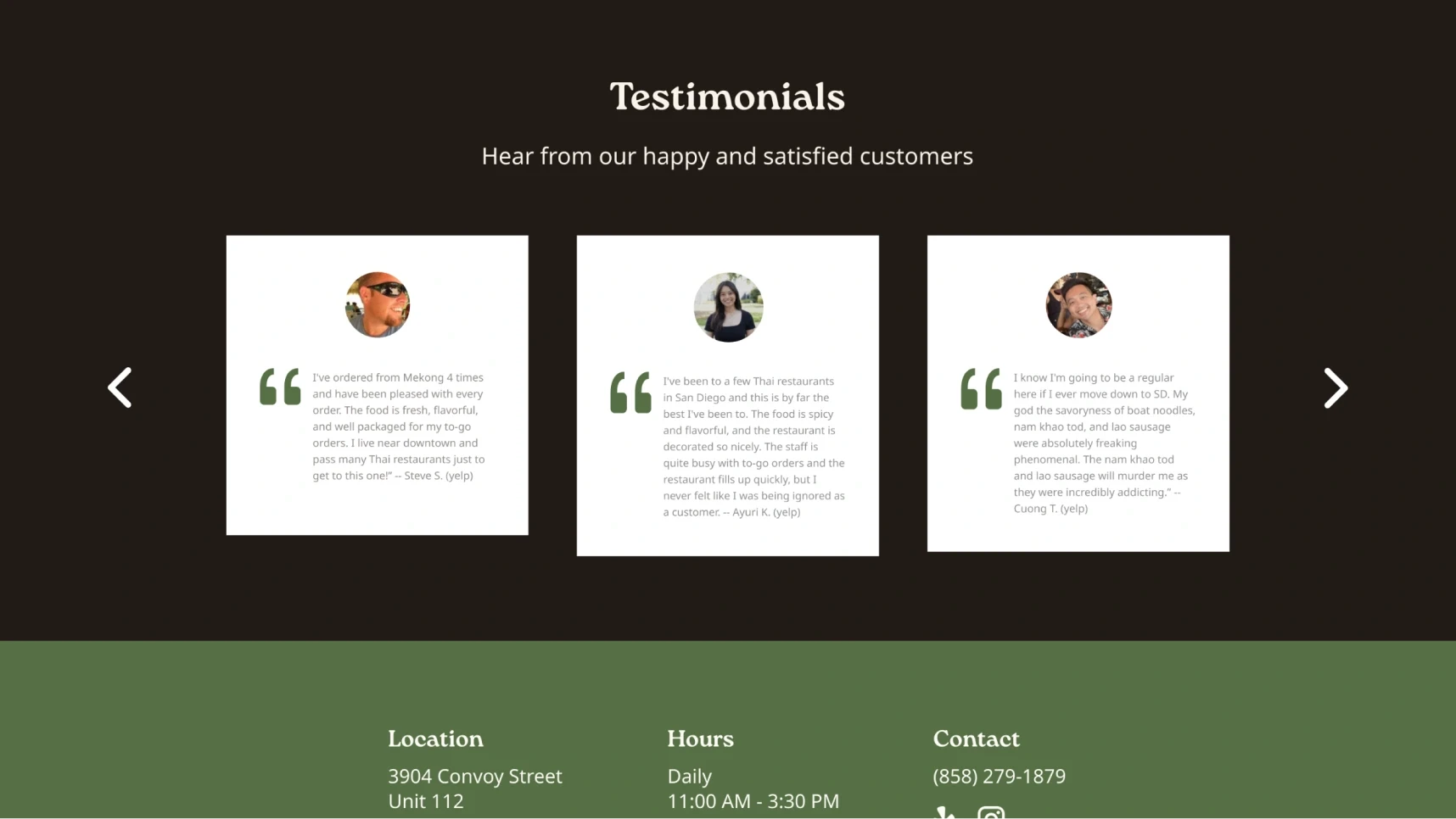
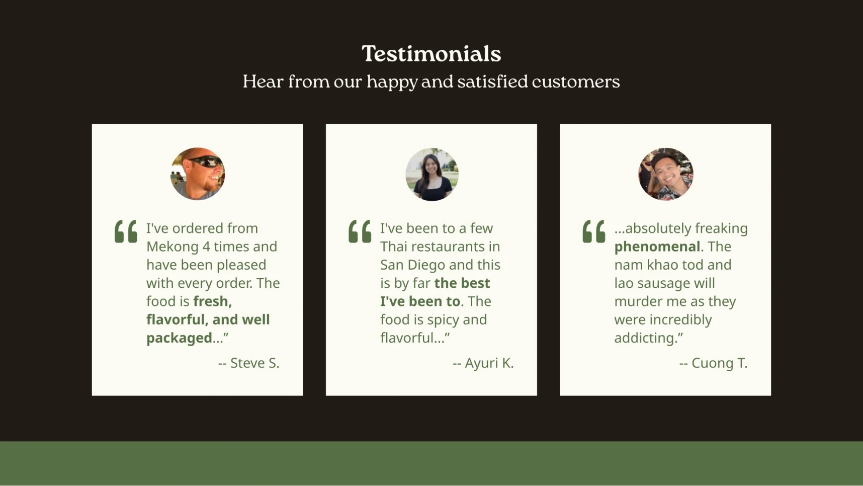
05. Resizing testimonials on the Home page

Before

The testimonials’ body text was too long and too small, making it hard to read for some testers.

After

I reduced each testimonials’ length, bolded keywords, and increased the font size to improve readability and clarity.

05. Resizing testimonials on the Home page

Before

The testimonials’ body text was too long and too small, making it hard to read for some testers.

After

I reduced each testimonials’ length, bolded keywords, and increased the font size to improve readability and clarity.

05. Resizing testimonials on the Home page

Before

The testimonials’ body text was too long and too small, making it hard to read for some testers.

After

I reduced each testimonials’ length, bolded keywords, and increased the font size to improve readability and clarity.

05. Resizing testimonials on the Home page

Before

The testimonials’ body text was too long and too small, making it hard to read for some testers.

After

I reduced each testimonials’ length, bolded keywords, and increased the font size to improve readability and clarity.

visual identity

Mekong Cuisine Lao & Thai: fresh, punchy, and warm

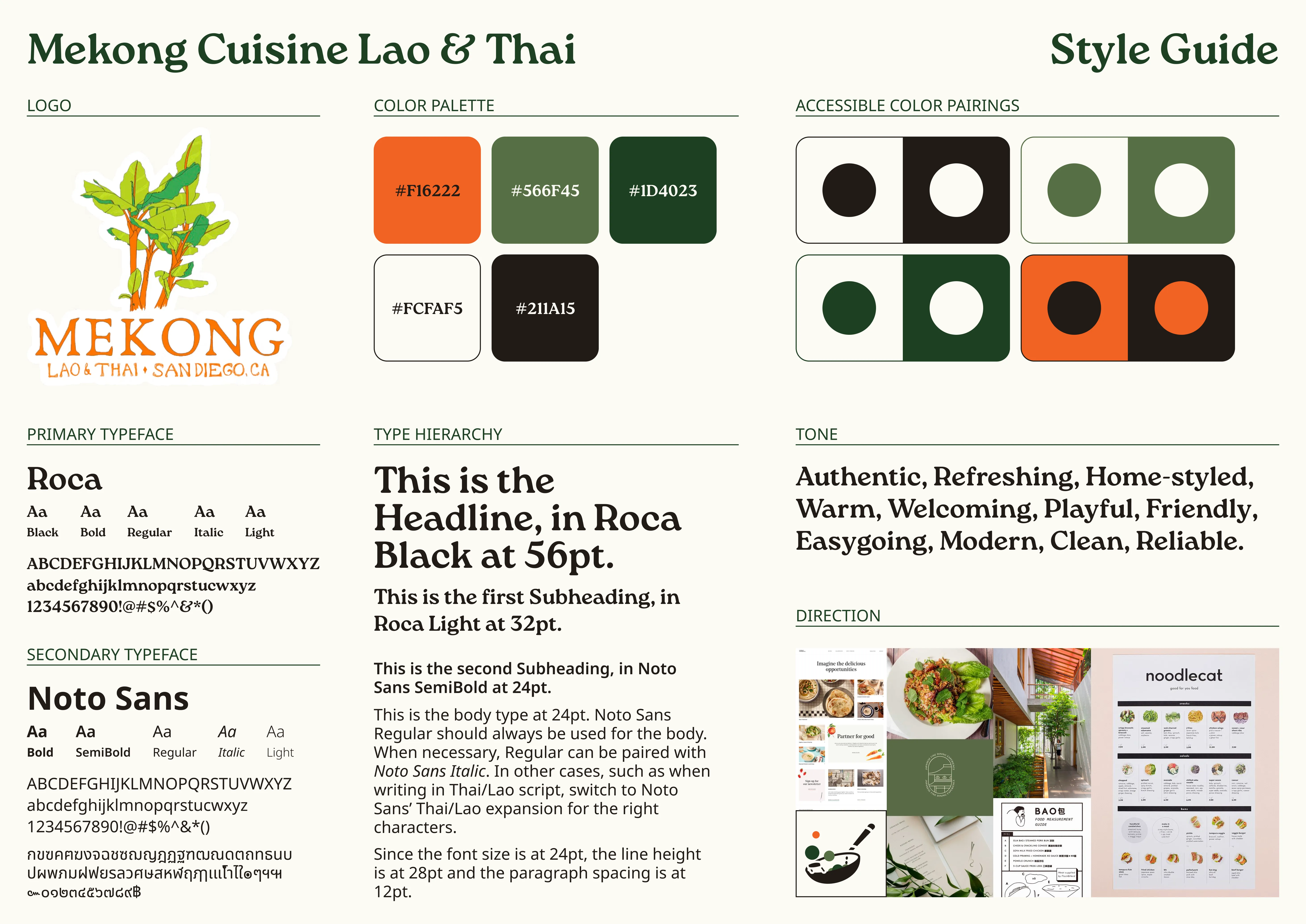
With many branding changes being made throughout our design process, it was necessary to create a simple style guide to ensure consistency then and in the future.

Our changes included: updating the color palette with fresh greens, a punchy orange, and warm neutrals for welcoming, homey vibes like the restaurant’s; changing the primary typeface to Roca, a friendly, round serif; and pairing Roca with Noto Sans to cover all Lao and Thai glyphs.

The style guide I created to encapsulate our changes and maintain consistency.

Final design

Mekong Cuisine Lao & Thai’s website redesign is here!

The final Figma desktop and mobile prototypes! (For better viewing experience, open this on desktop!)

Reflections

04

what i learned

re: The value of making time for feedback, even while lacking time

Though it was a bit hectic working around conflicting schedules and impending deadlines, making time to hold feedback sessions even while short on said time really helped. Setting expectations clear from the get-go with Mekong and making sure everyone’s voices were heard before moving on ensured that our designs were built on a steady foundation. With a couple rounds of user testing added on, what we gained far outweighed the cost — even with limited testers — and truly helped us succeed. It’s a valuable lesson to take with me into future projects.

next steps

Building the updated Mekong — physically and digitally — will take time

After presenting our final designs and Figma prototypes to Stella, we received many excited “it looks great!!”s and handed off our work. While the expansion is keeping them busy from implementation, we’re still in touch to discuss anything that comes up in the future, from how Mekong is doing to how well the website is performing.
View more work

Say hi —

I’d love to chat, whether it be for gushing over shared interests or working together on something special!

© 2024 Cindy Nguyen.

BACK TO TOP ↑

Say hi —

I’d love to chat, whether it be for gushing over shared interests or working together on something special!

© 2024 Cindy Nguyen.

BACK TO TOP ↑

Say hi —

I’d love to chat, whether it be for gushing over shared interests or working together on something special!

© 2024 Cindy Nguyen.

BACK TO TOP ↑