A Happier Me: Wellbeing Circle

ROLE

UI/UX Designer
Communication Liaison

TIMELINE

11 weeks
(Sep - Dec 2023)

TOOLS

Figma

team

4 developers
3 designers

Creating an online platform for A Happier Me to promote the wellbeing of high school and university students through mentorship, support, and free resources.

#WEBSITE-DESIGN

#VISUAL-DESIGN

#UI/UX-DESIGN

#WEBSITE-DESIGN

#VISUAL-DESIGN

#UI/UX-DESIGN

#WEBSITE-DESIGN

#VISUAL-DESIGN

#UI/UX-DESIGN

#WEBSITE-DESIGN

#VISUAL-DESIGN

#UI/UX-DESIGN

Overview

01

about

Designing an online platform to support Vietnamese student wellbeing and mental health

Happier Me is a social enterprise that collaborates with Vietnamese public high schools and universities to support students' wellbeing and mental health. Their latest project, Wellbeing Circle, seeks to raise awareness about social-emotional health, promote positive habits that increase student wellbeing, and teach valuable mental health practices to better the lives of Vietnamese youth. However, due to limited volunteers and busy personnel, they lacked the resources to design and launch the Wellbeing Circles platform.

role

Balancing design and management while maintaining consistent communication

As part of UC San Diego’s Global TIES program, Dr. Anh-Thu Ngo reached out to the founder of Happier Me to facilitate a collaboration between Happier Me and a team of her students. The founder, Phuong Anh Nguyen, hoped that we could build a platform to reduce work for their staff and the difficulty of the application process for students.

With only 11 weeks to complete the website, we each took up different roles and split our tasks by role and available bandwidth. Alongside another teammate, I also managed the project and team, making the following my overall responsibilities.

Project Management
  • Co-led weekly team meetings to facilitate updates between design and development teams, delegate tasks, and review timeline.

  • Led team meetings with Happier Me’s founder to provide updates and discuss user research.

  • Took notes and minutes for each meeting, organizing them for later review.

Visual + UI/UX Design
  • Conducted user interviews, consolidated findings, and produced 2 user personas.

  • Designed and prototyped the high-fidelity version of the Home and About pages, navigation bar, footer, and other interactive components.

  • Worked on further iterations of Resources, Login, and Sign-up pages following user testing and finalized their designs.

  • Created multiple graphic elements and organized a style guide.

Communication
  • Maintained regular communication with Happier Me’s founder and software engineer through weekly updates.

  • Coordinated and facilitated meetings with Happier Me members for updates, user interviews, and user testing.

problem statement

How might we connect Vietnamese high school and university groups to crucial social-emotional health resources in a way that is accessible and sustainable for the long-term?

design solution & highlights

Introducing the Wellbeing Circle website…


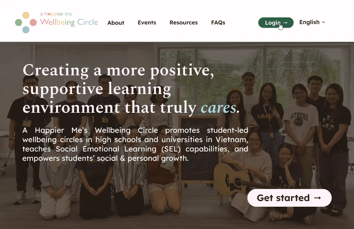
Information about Happier Me’s Wellbeing Circle right at one’s fingertips

Upon loading, users are immediately greeted with Happier Me’s mission, the goals and benefits of Wellbeing Circle, and ways to get involved.

Sign-up made easy and accessible everywhere

The website features many opportunities to sign up, with buttons on the sticky navigation bar, links on the footer, and shortcuts throughout the website all serving to show users the way.

A vibrant, playful look paired with dynamic interactions and photos to engage users

The Wellbeing Circle website makes consistent use of rich colors, round and cloud-like shapes, and colorful hover animations to draw users in and guide them through resources and tutorials.

Research

02

setting objectives

Outlining expectations, desired features, and goals

To better understand Happier Me’s goals, I arranged an online interview with the primary stakeholders: Phuong Anh, Happier Me's founder, and Vinh, their software engineer. This allowed us to set up further communication, arrange user interviews with Happier Me members, learn more about Happier Me’s history, and understand the website’s functions and needs.

From here, we were able to set the following objectives to guide our design:

  • Develop a website with intuitive navigation, accessible content, and clear CTAs to easily guide users through the sign-up and learning process for Wellbeing Circle

  • Create simple, dynamic features to engage users as they learn about the Wellbeing Circle project

  • Employ a colorful, playful visual style to connect with users

user interviews

Lack of direction, variety in lessons, and support from others are to blame

We conducted 7 online interviews to hear from current Wellbeing Circle members about their experiences, how they benefited, and what would’ve made their journey smoother. While our pool was a little limited due to time zone differences, lack of availability, and language barriers, we ultimately gained many useful insights.

Lack of time, guidance, and self-discipline were cited by all as major barriers to consistently practicing and learning about social-emotional wellbeing, especially when paired with how mental health is stigmatized in Vietnam.

“My parents don’t seem to support or understand it…social-emotional wellbeing isn’t popular here and it’s difficult to find friends or clear instructions to learn about it.”

- Interviewee 2

“My parents don’t seem to support or understand it…social-emotional wellbeing isn’t popular here and it’s difficult to find friends or clear instructions to learn about it.”

- Interviewee 2

“My parents don’t seem to support or understand it…social-emotional wellbeing isn’t popular here and it’s difficult to find friends or clear instructions to learn about it.”

- Interviewee 2

Many interviewees expressed that having a common framework and being able to make connections to other members would make it easier to form a Wellbeing Circle.

“..some clubs can be slower than others and lose direction on where to proceed next, so I feel like we should make a framework or guide on how to form and run a Wellbeing Circle.”

- Interviewee 6

“..some clubs can be slower than others and lose direction on where to proceed next, so I feel like we should make a framework or guide on how to form and run a Wellbeing Circle.”

- Interviewee 6

“..some clubs can be slower than others and lose direction on where to proceed next, so I feel like we should make a framework or guide on how to form and run a Wellbeing Circle.”

- Interviewee 6

Interviewees felt that using a mix of interactive lessons, videos, and readings would aid in the learning process; 1-on-1 instruction with a mentor or through other circles would also be beneficial.

“It can be hard to make students enjoy things, but interactive content like videos or just involving communication would make people want to take part.”

- Interviewee 4

“It can be hard to make students enjoy things, but interactive content like videos or just involving communication would make people want to take part.”

- Interviewee 4

“It can be hard to make students enjoy things, but interactive content like videos or just involving communication would make people want to take part.”

- Interviewee 4

user personas

Understanding the needs of Wellbeing Circle users: students and administrators

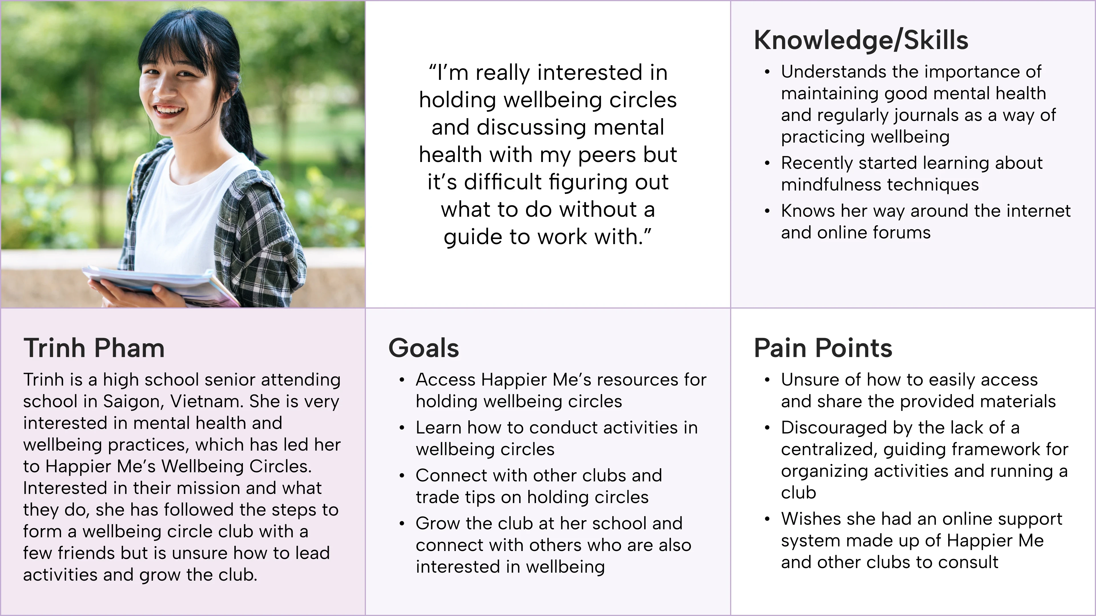
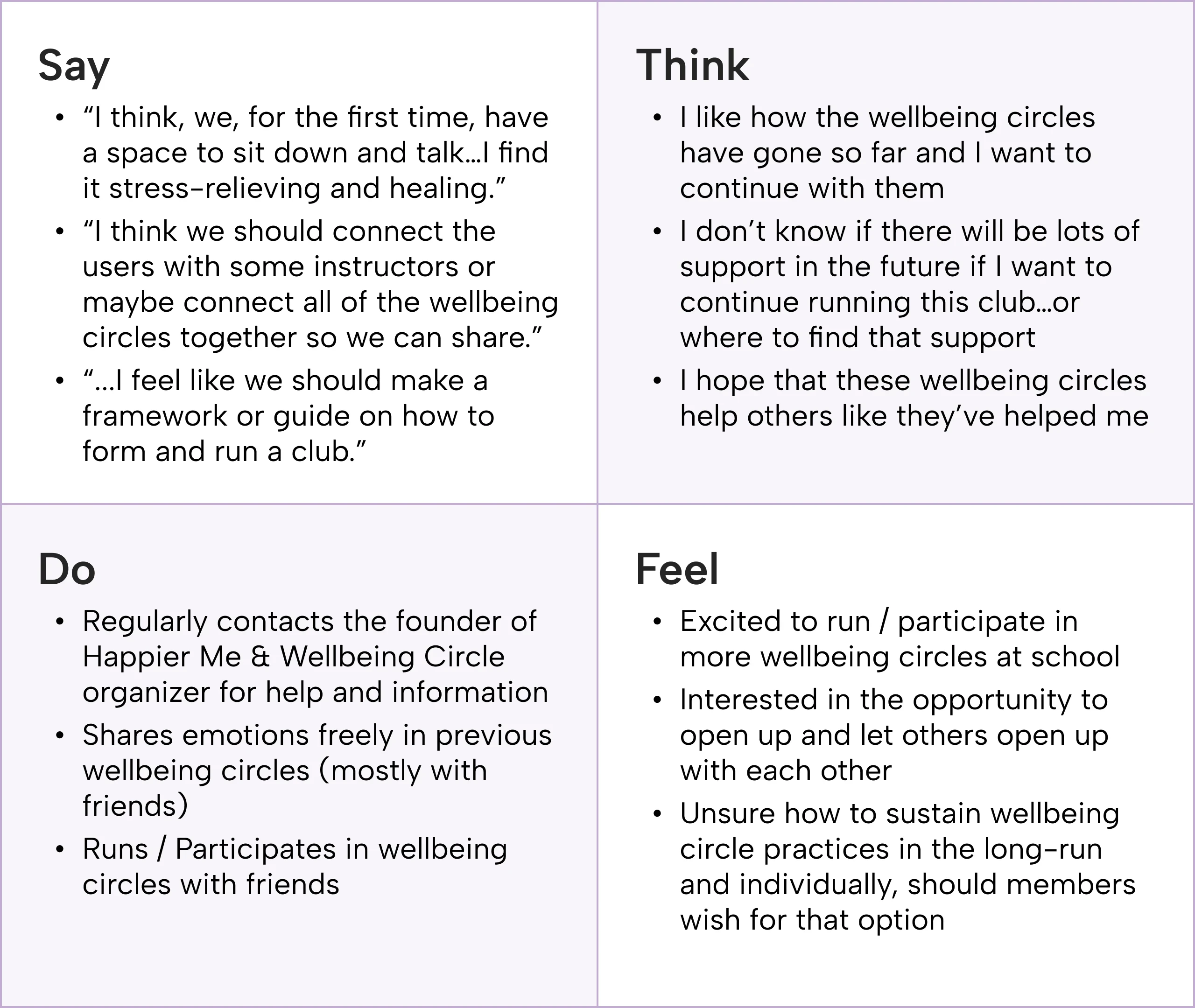
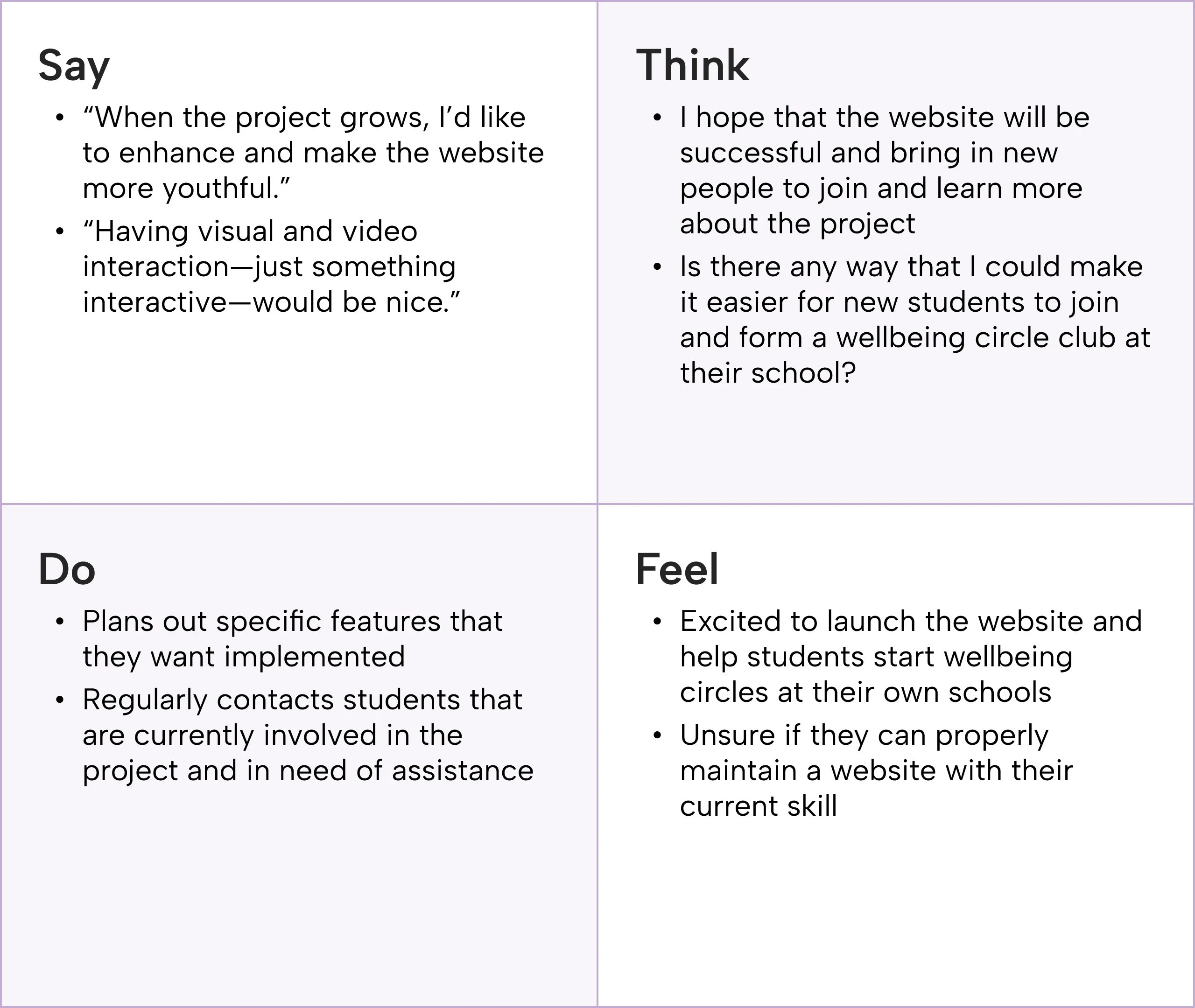
Using our findings from the stakeholder and user interviews, we developed two user personas — Trinh and Khoi — and accompanying empathy maps to focus on user needs before designing.

  • Trinh represents student Wellbeing Circle members looking to find ways to manage the circle at her school, access and share learning resources, and request mentorship or guidance from others.

  • Khoi represents Wellbeing Circle administrators looking to implement fun, intuitive ways for students to learn more about the program, as well as integrate user feedback.

Meet Trinh: our student user personas representing the majority of the Wellbeing Circle project audience. Her empathy map is on the right.

Khoi, on the other hand, represents Happier Me staff that will be running Wellbeing Circle. His empathy map is based off of stakeholder conversations.

existing solutions analysis

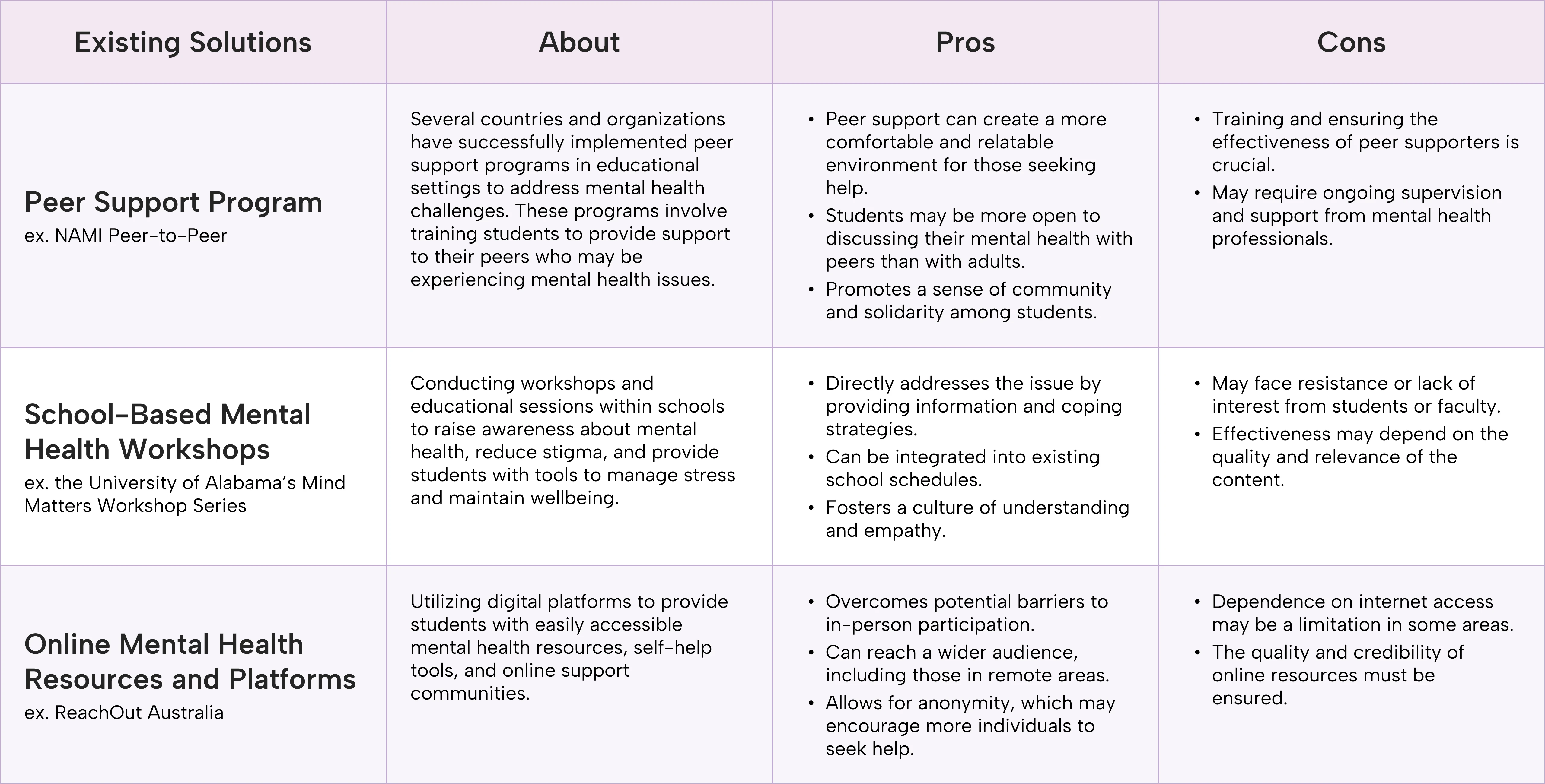
Comparing peer support programs, mental health workshops, and online resources

We then ran an analysis of existing solutions that share Wellbeing Circle’s goals. This allowed us to identify ways to structure the provided resources:

  • Presenting ways for Wellbeing Circle students to connect and learn together may build community and boost learning.

  • Teaching students how to hold mental health workshops at their respective schools may raise more awareness and encourage joining.

Our existing solutions analysis, focused on programs similar to Wellbeing Circle: peer support programs, school-based mental health workshops, and online mental health resources and platforms.

Design

03

wireframes

Quick layouts, feedback, and development

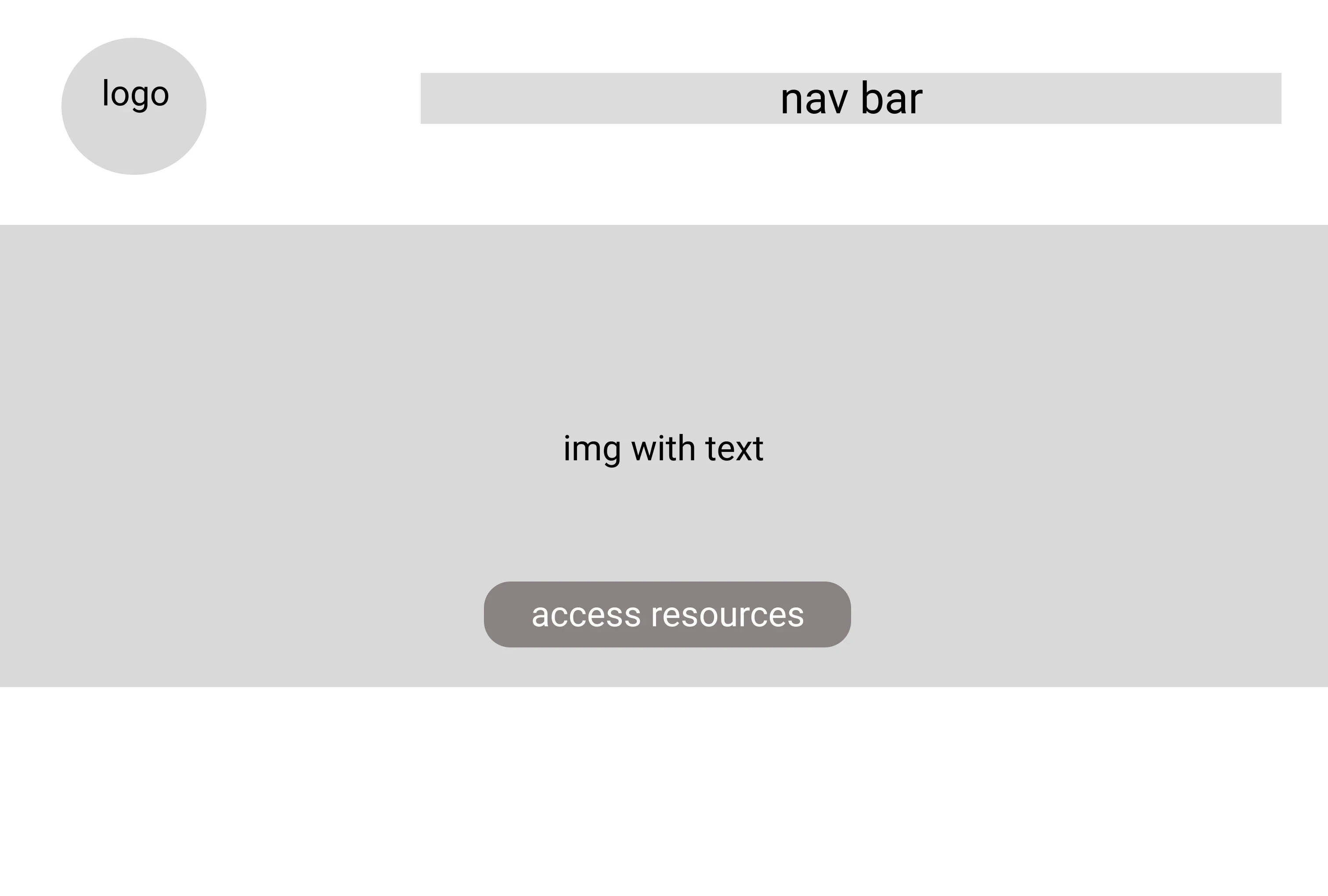
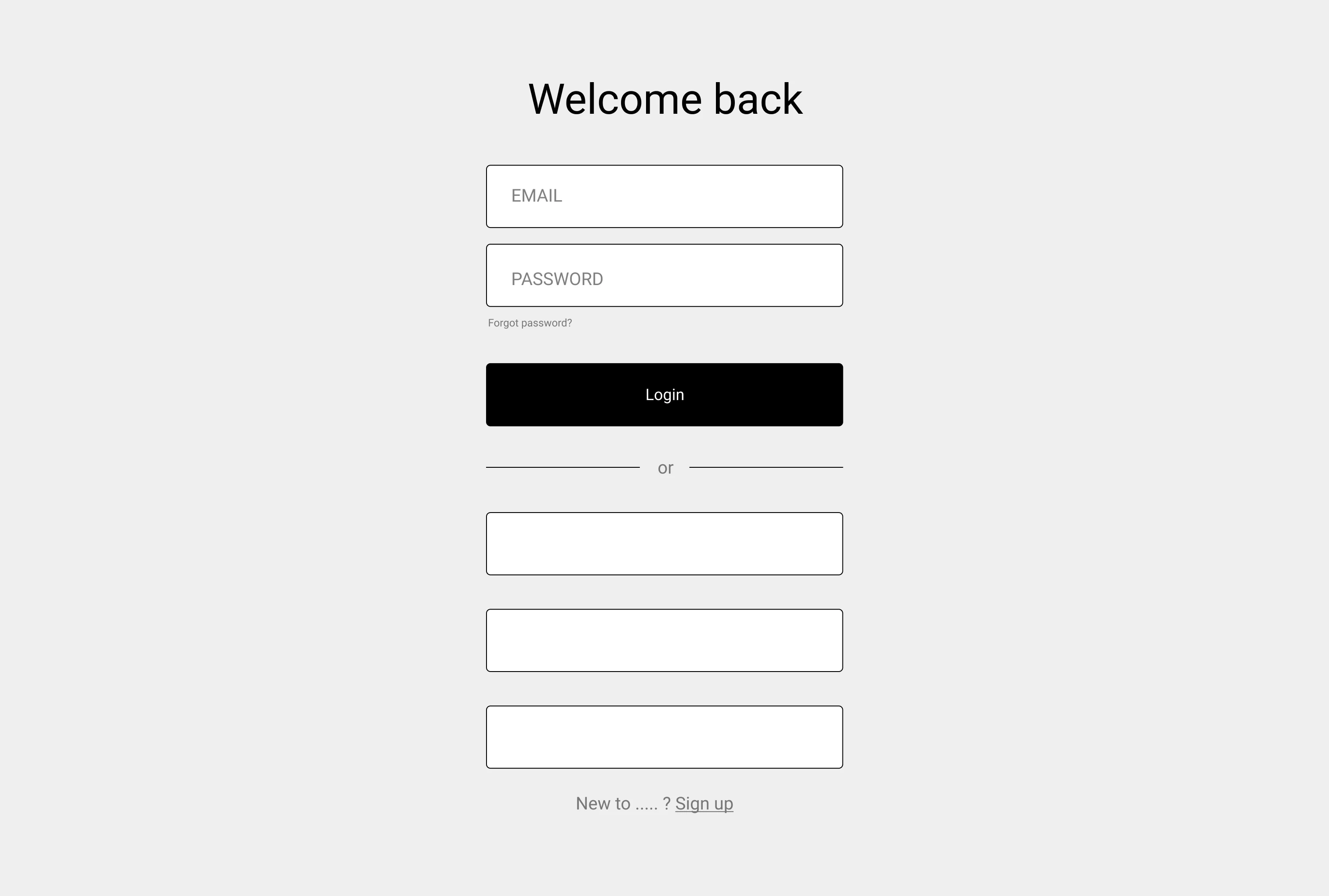
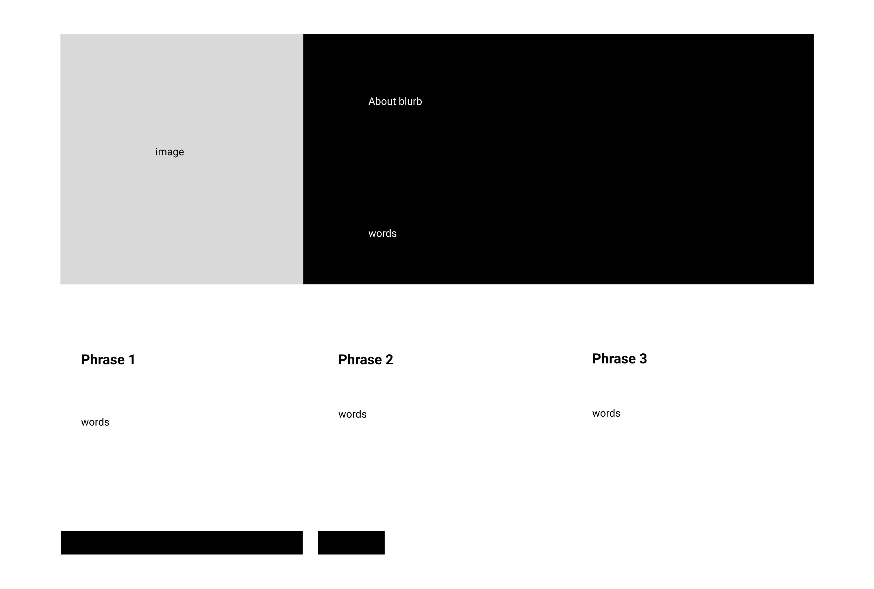
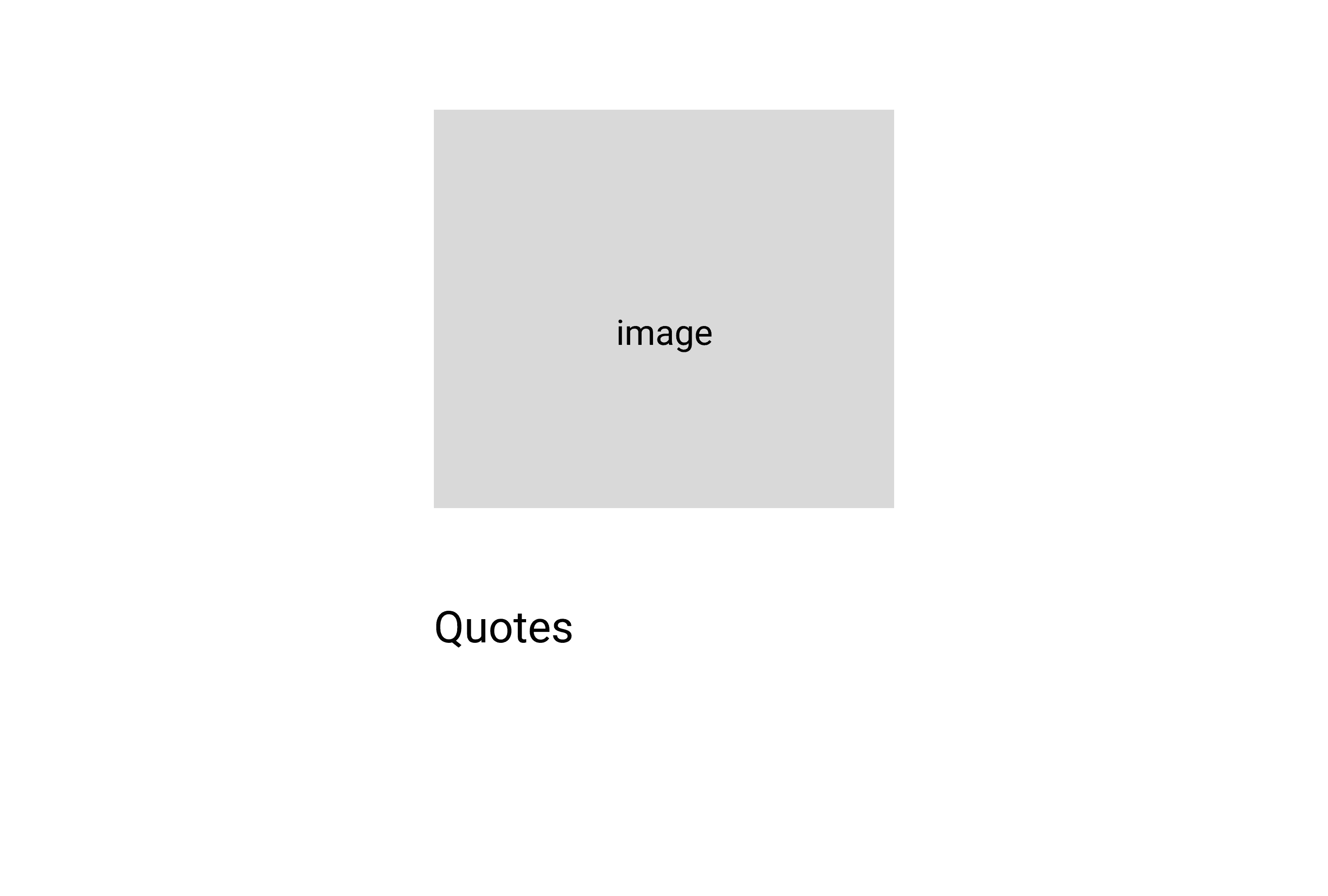
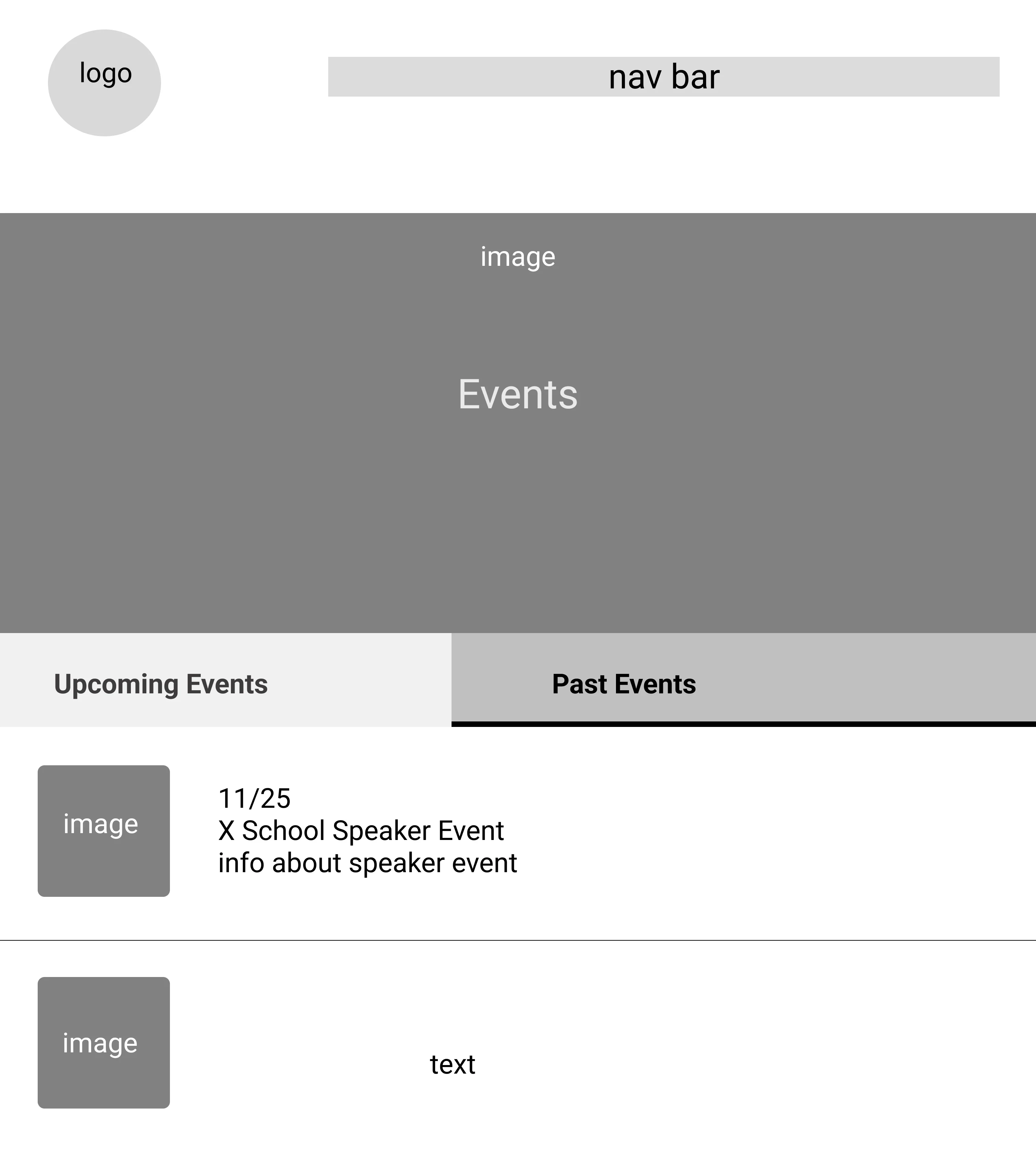
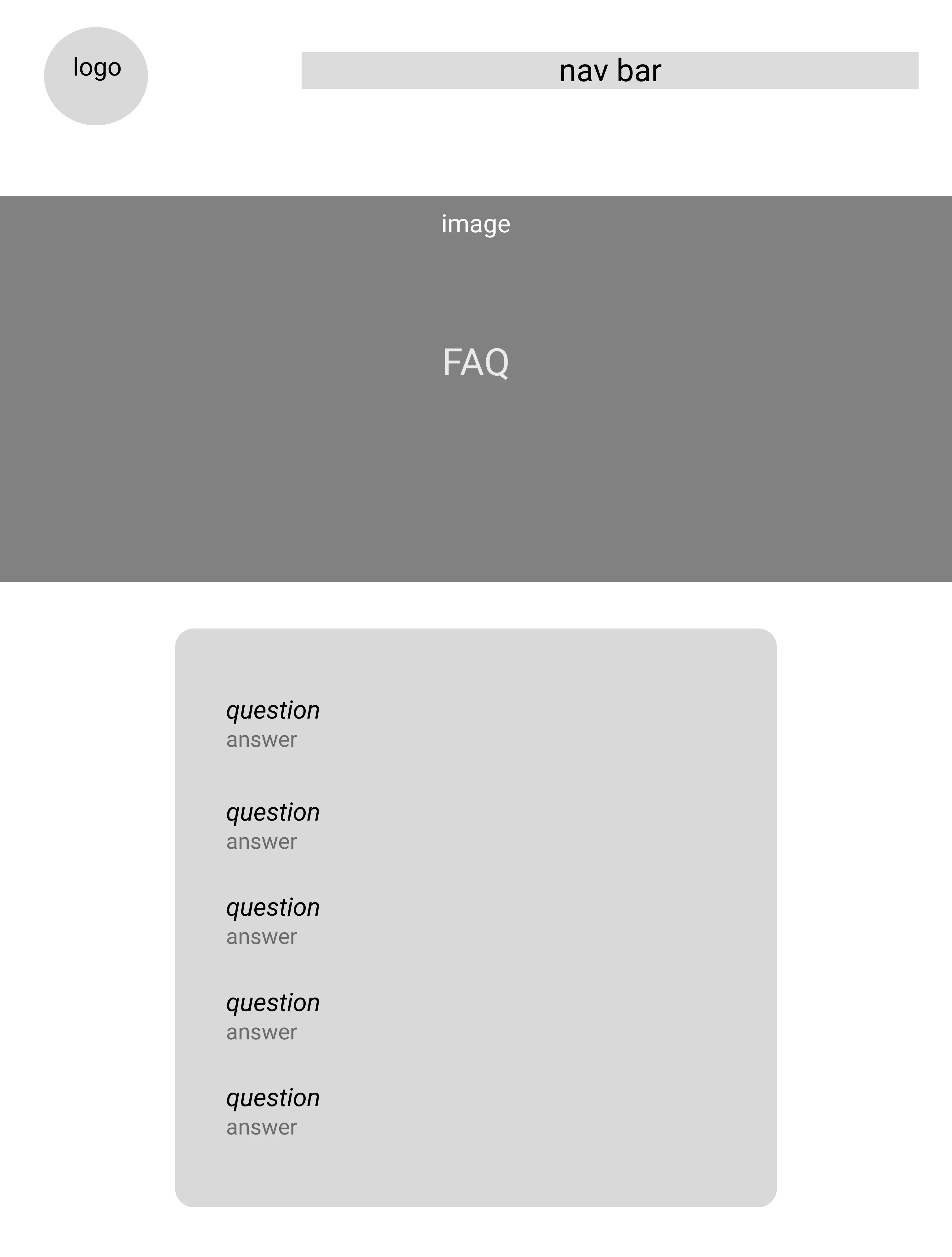
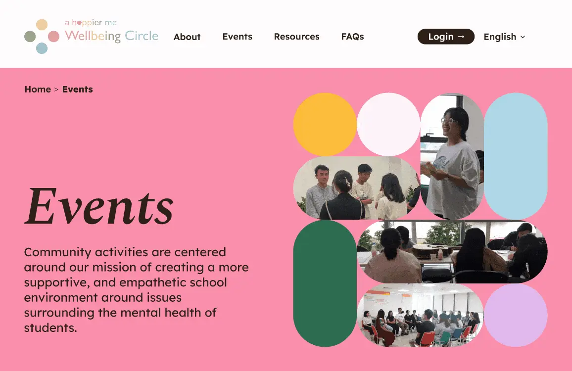
Going off Happier Me’s suggested sitemap and required functions for Wellbeing Circle, we quickly created wireframes for the website’s main pages. The layouts of the Home, Login/Sign-up, About, Resources, Events, and FAQ pages were kept simple to accommodate additional content on Happier Me’s part.

From the top-left to bottom-right: Home, Login, About, Resources, Events, and FAQ wireframes.

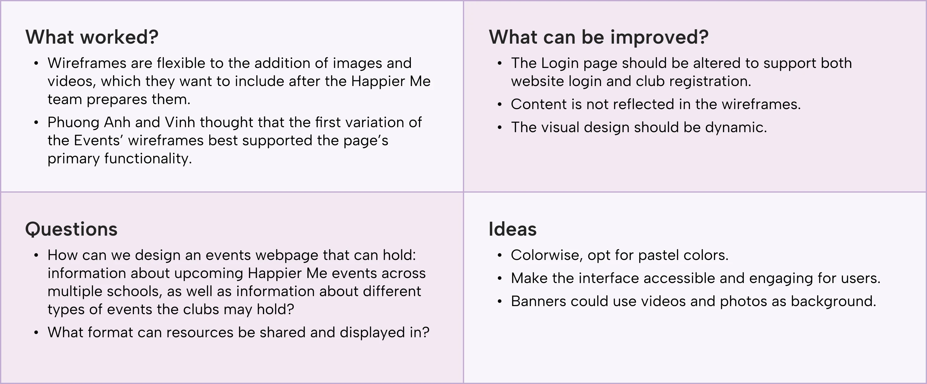
After a brief clarifying and feedback session with Phuong Anh and Vinh, we organized their comments into a capture grid, which we used to develop mid-fidelity prototypes.

The feedback we gained from Phuong Anh & Vinh, organized in a capture grid form.

user testing

Assessing the hi-fi’s intuitiveness, usability, and desirability

As we finished up our high-fidelity prototype, I arranged a round of user testing with the previous 7 Wellbeing Circle members to assess the intuitiveness, usability, and desirability of the designs.

4.75/5

average usability rating

average usability rating

average usability rating

“Easy to navigate, just basically smooth interactions all throughout the website!”

- Interviewee 3

3/7

interviewees wanted more visuals and to be able to connect with peers

interviewees wanted more visuals and to be able to connect with peers

interviewees wanted more visuals and to be able to connect with peers

“I’d like to see more pictures of members working together or an interview video to show more activities being conducted.”

- Interviewee 4

5/5

average visual design & aesthetics rating

average visual design & aesthetics rating

average visual design & aesthetics rating

“I love the vibe of the website! The colors are not too flashy, but really gentle and healing.”

- Interviewee 1

“Easy to navigate, just basically smooth interactions all throughout the website!”

- Interviewee 3

“I’d like to see more pictures of members working together or an interview video to show more activities being conducted.”

- Interviewee 4

“I love the vibe of the website! The colors are not too flashy, but really gentle and healing.”

- Interviewee 1

iterations

Improving visual consistency, interactivity, and discoverability

Despite scheduling constraints that shortened interview times and reduced how much we could test, the feedback that we did receive helped us focus our efforts on creating visual consistency, adding interactivity, and improving discoverability.

01. Reorganizing the Home page and adding interactive learning opportunities

Before

The Home page featured a single section. Many testers expressed a wish for more fun, interactive sections.

After

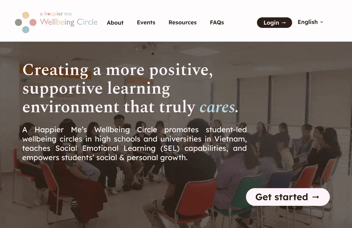
Three additional sections with hover animations and colorful diagrams were added to give a brief introduction to Wellbeing Circles and encourage users to sign up at the end.

02. Clarifying requirements on the Sign-up page and adding visual consistency

Before

The type hierarchy and visual language on the Sign-up page didn’t match the rest of the website’s, with sharp edges and inconsistent font weights and sizes. The lack of specific requirements for the password also concerned an interviewee.

After

I remade the Sign-up page, adhering to our branding and visual style by following the type hierarchy present throughout the site and using the round design elements from our component library. I also added additional copy to specify requirements and created a Login page.

03. Editing the Resources page for visual consistency and accessibility

Before

Sections in the Resources page featured harsh color contrasts, sharp edges, and colors outside of the palette, which felt out of place and was hard to read for some testers.

After

I reorganized the page and edited colors, card styles, and layout to fit in with the website’s branding and increase readability. I also added a highlight video to anchor the page instead of having users read through paragraphs.

04. Adjusting color of event cards to improve discoverability

Before

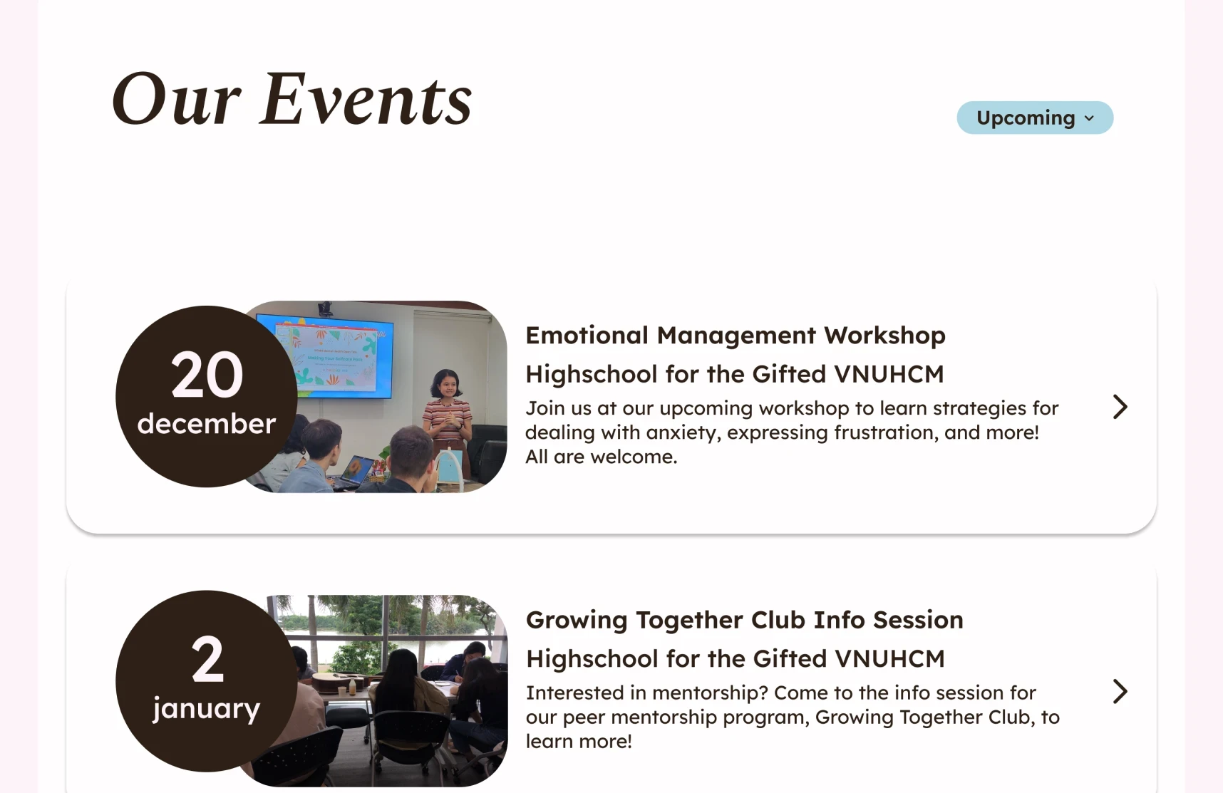
Event cards were the same color as the background and only had a small shadow to outline them. Some testers didn’t know that they could be clicked.

After

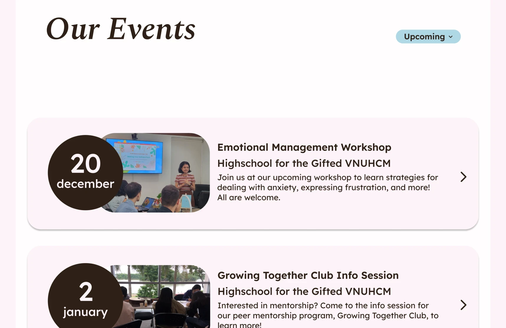
The color of the event cards were changed, increasing the contrast between the cards and the background.

05. Creating an event page template

Before

Our stakeholders expressed that they’d like a template for public events shown on the Events page.

After

We created an example event page, complete with necessary details and a section to explore other events.

05. Creating an event page template

Before

Our stakeholders expressed that they’d like a template for public events shown on the Events page.

After

We created an example event page, complete with necessary details and a section to explore other events.

05. Creating an event page template

Before

Our stakeholders expressed that they’d like a template for public events shown on the Events page.

After

We created an example event page, complete with necessary details and a section to explore other events.

05. Creating an event page template

Before

Our stakeholders expressed that they’d like a template for public events shown on the Events page.

After

We created an example event page, complete with necessary details and a section to explore other events.

visual identity

Vibrant, gentle, and healing colors and typefaces

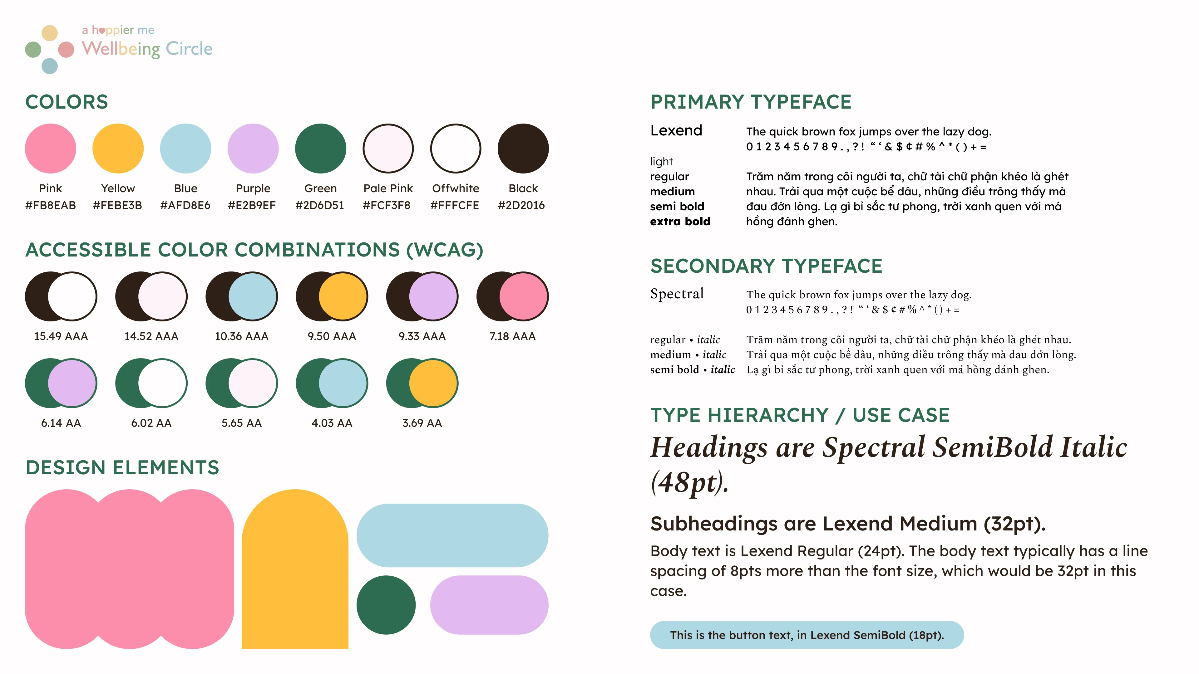
Wellbeing Circle’s visual style features vibrant colors, reader-friendly typefaces like Lexend and Spectral, and playful, round design elements — all a bit distinct from Happier Me’s branding. These changes reflect Happier Me’s desire to define this project as separate and our concerns about the accessibility of the previous pastel color palette. To capture these changes and give the resources necessary for Happier Me to maintain consistency after hand-off, I created a simple style guide, shown below.

The style guide I put together for Wellbeing Circle.

Wellbeing Circle’s color palette is a mix of bright, playful colors and gentle, pastel colors, all of which serve to provide a sense of friendliness, safety, and positivity. Lexend and Spectral were chosen as main typefaces for their Vietnamese language support and specialized design for reducing visual stress.

final design

A Happier Me’s Wellbeing Circle project is almost ready!

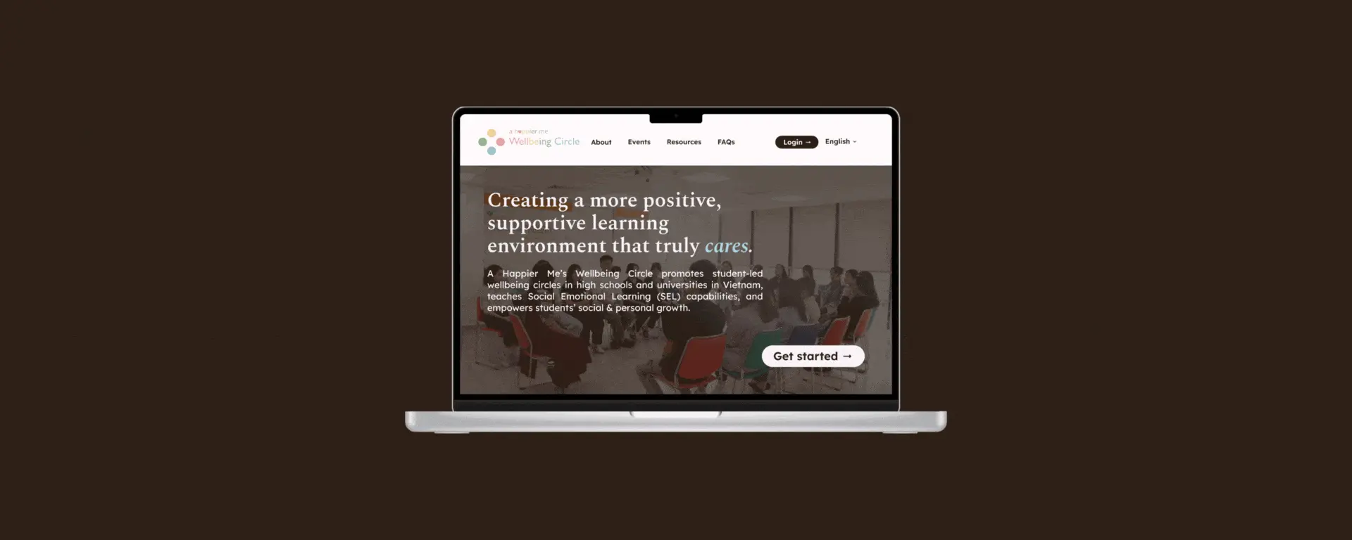
The final hi-fi prototype, on Figma. Open this page on desktop to interact with the prototype!

Reflections

04

what i learned

Maintaining consistent communication can sometimes be the most difficult task — but it is crucial for success

Faced with a 15 hour time difference, busy schedules leading to little viable meeting times, and some language obstacles, communication was hard. However, as it was my job, I dealt with it by creating timelines, planning weeks ahead, and consistently sending emails, check-ins, and updates. I learned how to work around the students’ limited availability during user testing by blocking out times weeks in advance and sending take-home surveys; I handled my team’s limited availability during stakeholder-team meetings by preparing my team’s questions, recording the meeting, and taking notes. In the end, we were able to create designs that met Happier Me’s needs and I was proud to have been able to relay Happier Me’s approval to my team.

next steps

Still a work in progress but we’re at implementation now!

Though our class has long ended, Happier Me’s Wellbeing Circle project is still in development and in need of implementation. For now, our team has handed off our work to Happier Me and I, alongside a teammate, have made ourselves available for further designs and consulting as Vinh begins implementation. There’s a lot to be done, such as: additional pages for the formal joining process, feedback section, and personal Circle dashboard; the Vietnamese translation and updated copy; and a mobile version.

a huge thanks to —

Phuong Anh Nguyen, the founder of Happier Me — thank you for your patience, trust, and kindness in allowing us to work with you and your students to develop the Wellbeing Circles project! It was an honor.

Vinh Truong, Happier Me’s software engineer — your developer-reality checks, support, and feedback were endlessly appreciated.

Dr. Anh-Thu Ngo, our professor — I don’t think we would’ve had this opportunity if not for you and your guidance throughout the quarter.

Our interviewees, students involved with Happier Me — thank you all for participating, giving up your mornings, and bearing with my limited Vietnamese. It couldn’t have been easy doing it all in English, but I’m glad some of you liked the opportunity to practice.

Adeline, Sarbjot, Sungyoung, Anna, Kristine, and Cassandra — look at us! Late meetings, crazy schedules, and 11 weeks later and here we are! It was so great to work with y’all!!
View more work

Say hi —

I’d love to chat, whether it be for gushing over shared interests or working together on something special!

© 2024 Cindy Nguyen.

BACK TO TOP ↑

Say hi —

I’d love to chat, whether it be for gushing over shared interests or working together on something special!

© 2024 Cindy Nguyen.

BACK TO TOP ↑

Say hi —

I’d love to chat, whether it be for gushing over shared interests or working together on something special!

© 2024 Cindy Nguyen.

BACK TO TOP ↑