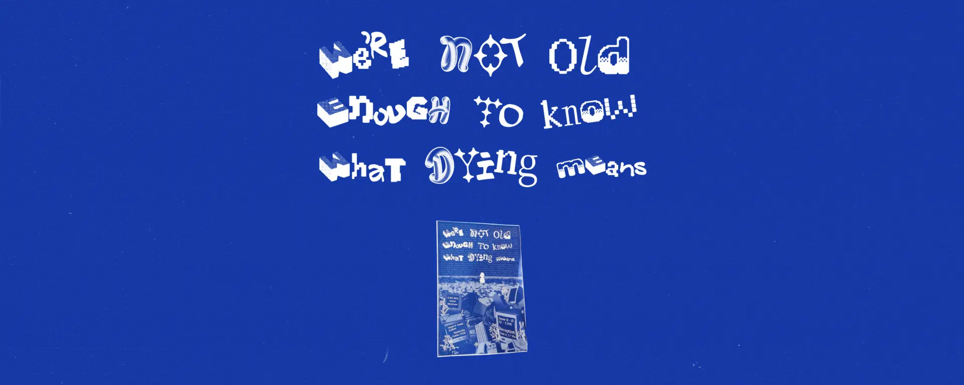
We’re Not Old Enough To Know What Dying Means
ROLE
Graphic Design & Promotions Coordinator
TIMELINE
3 weeks
(May - Jun 2024)
TOOLS
Procreate, Figma, Adobe Photoshop, Adobe Illustrator
team
2 designers
Promoting the ICAM 2024 Senior Showcase through physical and digital marketing.
Overview
01
about
Introducing... the 2024 ICAM Senior Showcase
We’re Not Old Enough To Know What Dying Means was a public art exhibition that took place from June 11th to June 13th, 2024 at the Adam D. Kamil Gallery in UC San Diego. From cozy desktop games to screaming interactive installations, the exhibition showcased 37 senior projects in Interdisciplinary Computing and the Arts, or ICAM, all of which were developed across 20 weeks by ICAM upperclassmen.
role
Designing physical and digital content for marketing
Together, my classmate Siul and I designed and produced flyers, A-frame signs, Instagram story templates, Instagram posts, and exhibition pamphlets for publicity. I took charge of the hand-drawn assets, text layouts, and exhibition pamphlet design.
Design
02
exhibition graphics
Ideating, creating, iterating, repeat
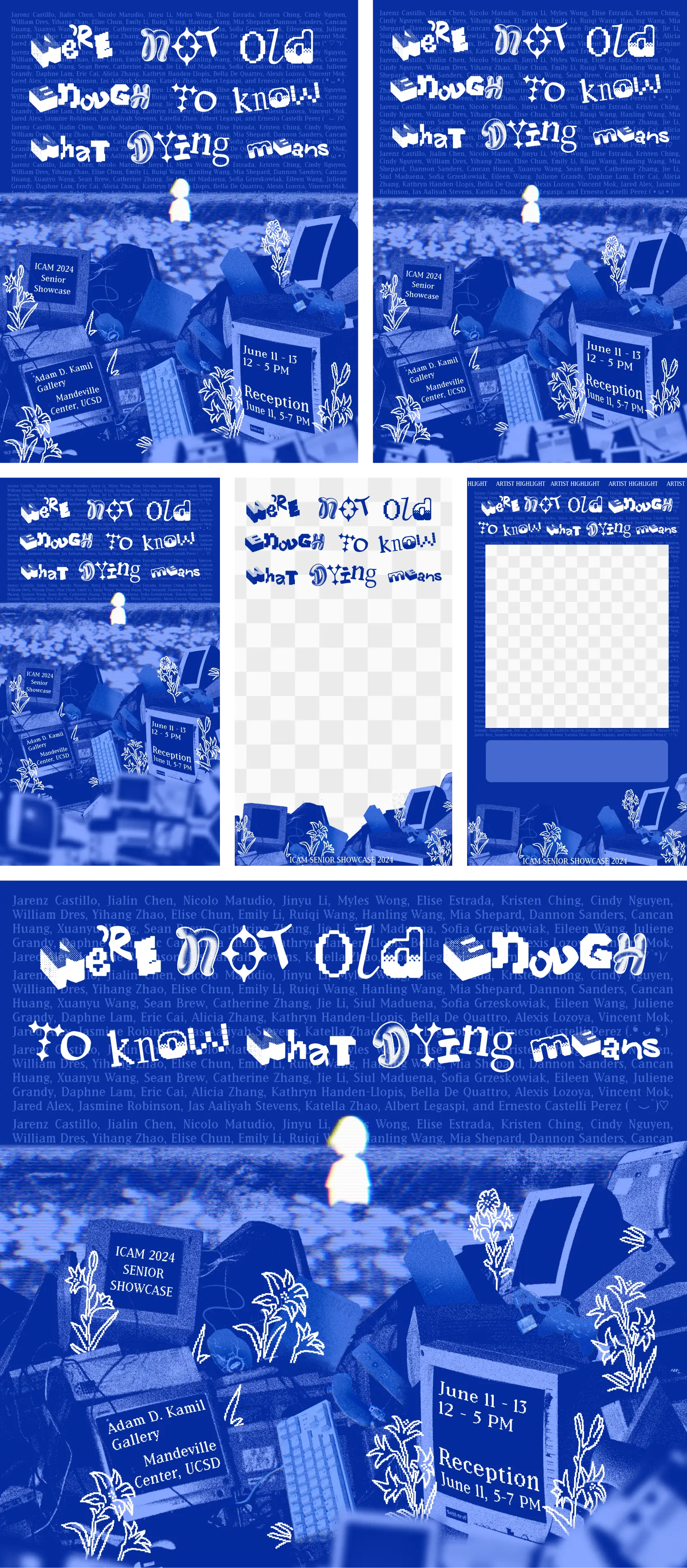
After settling on an exhibition name, our student curators gave us the go-ahead, allowing us to brainstorm visuals, tone, and colors. The final visual is largely inspired by the infamous blue screen of death, with the analog computers, broken devices, field of flowers, and childlike figure alluding to the title’s theme of death and innocence.
Our initial ideas, sketches I created, and collaborative moodboard.


A couple of beginning explorations. We later changed the layout of certain graphic elements and omitted others.
Following several iterations, we further refined the first of the four versions above. Here, I warped the text to the computer screens, added an analog screen effect and glitchiness to the graphic to highlight the digital aspect, drew white pixel lilies for their association with death and innocence, and compiled each student’s name to act as the blue screen error message.
The final design, in varying dimensions and formats
Featuring: the standard 8.5 x 11 flyer, an A-frame version, 3 story formats, and a square layout for Instagram.
exhibition pamphlet
Providing clarity for visitors and mementos for others
When the finalized design for marketing materials were sent to print, I immediately got to work on creating the pamphlets for the exhibition. I kept these simple, opting to include the exhibition details, where everyone’s exhibits were, and a QR code to check out the projects after the exhibition.

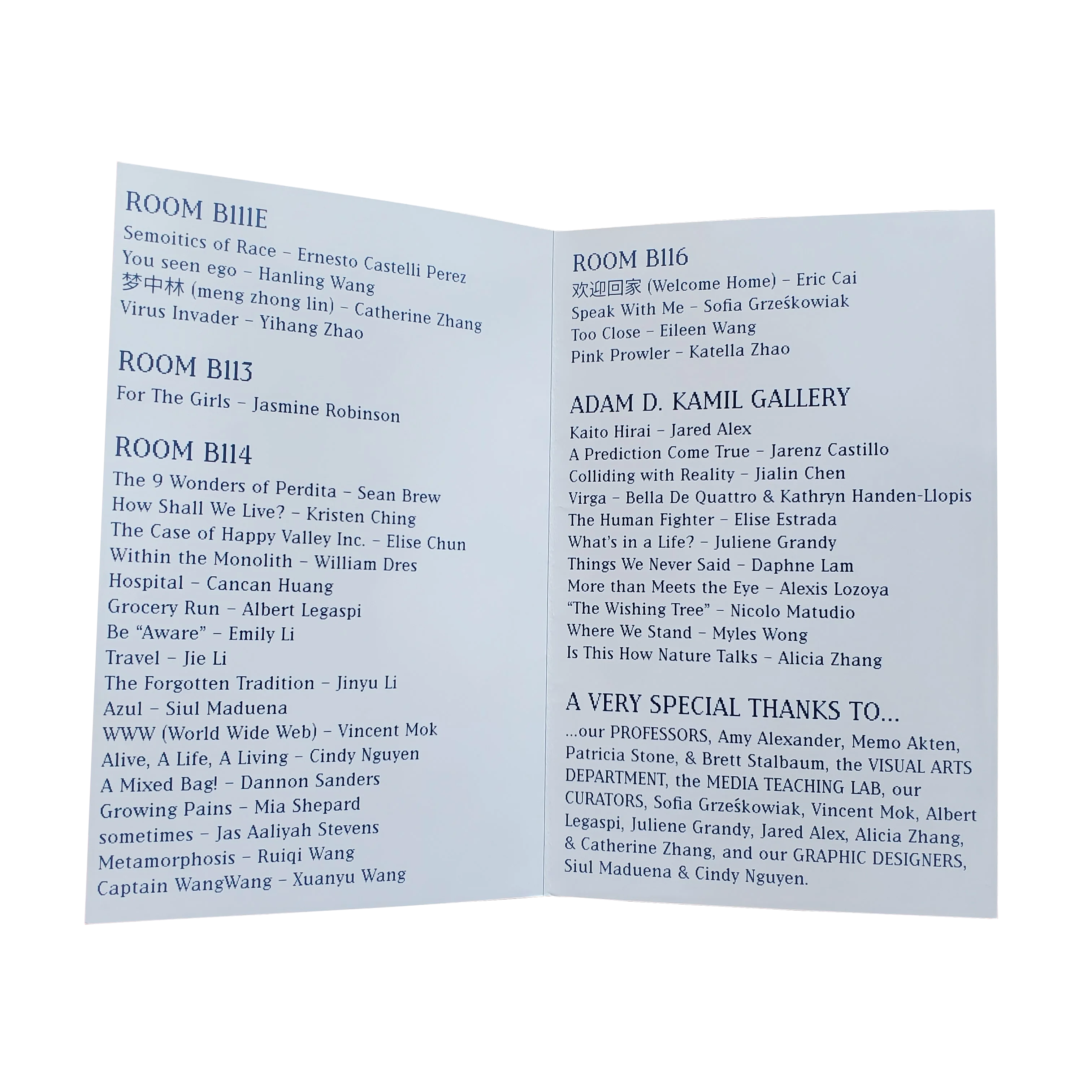


The printed pamphlet.
Reflections
03
exhibition day
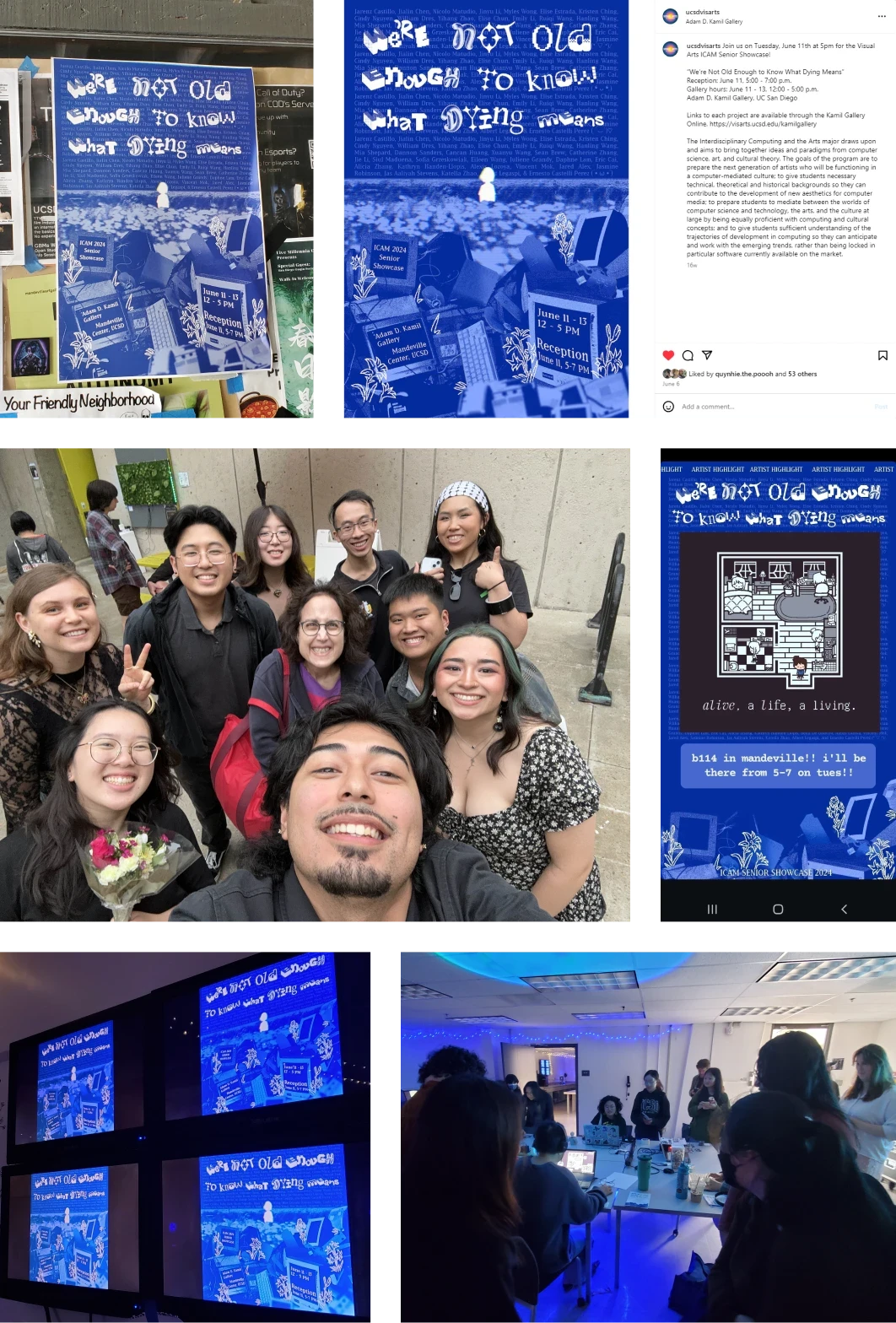
And that’s a wrap on ICAM 2024!
A full house at our reception! We couldn’t be any more proud.
what i learned
Second time’s the cherry on top
This was my second time designing marketing material for an art exhibition and I can’t have imagined how different it would be. I absolutely loved working as a duo and being able to bounce off ideas, learn from each other, and push each other to our creative best. Everything couldn’t have gone as well as it did if I hadn’t experimented more than I was used to, so I’m glad to have been led out of my comfort zone.
Taking a step back to breathe and look at your work was super effective!
Balancing the production of marketing materials and the last 40% of development for your game is intense, not to mention going through it together with your teammate, who’s in the same position. A big hug and thanks to Siul—absolute buck wild behavior on both our parts, but we really did that!!
